Branding for Architects
Our methodology centres on identity and meaning before execution – not unlike the way you approach architecture, master planning and interiors. It's about establishing the foundations properly.
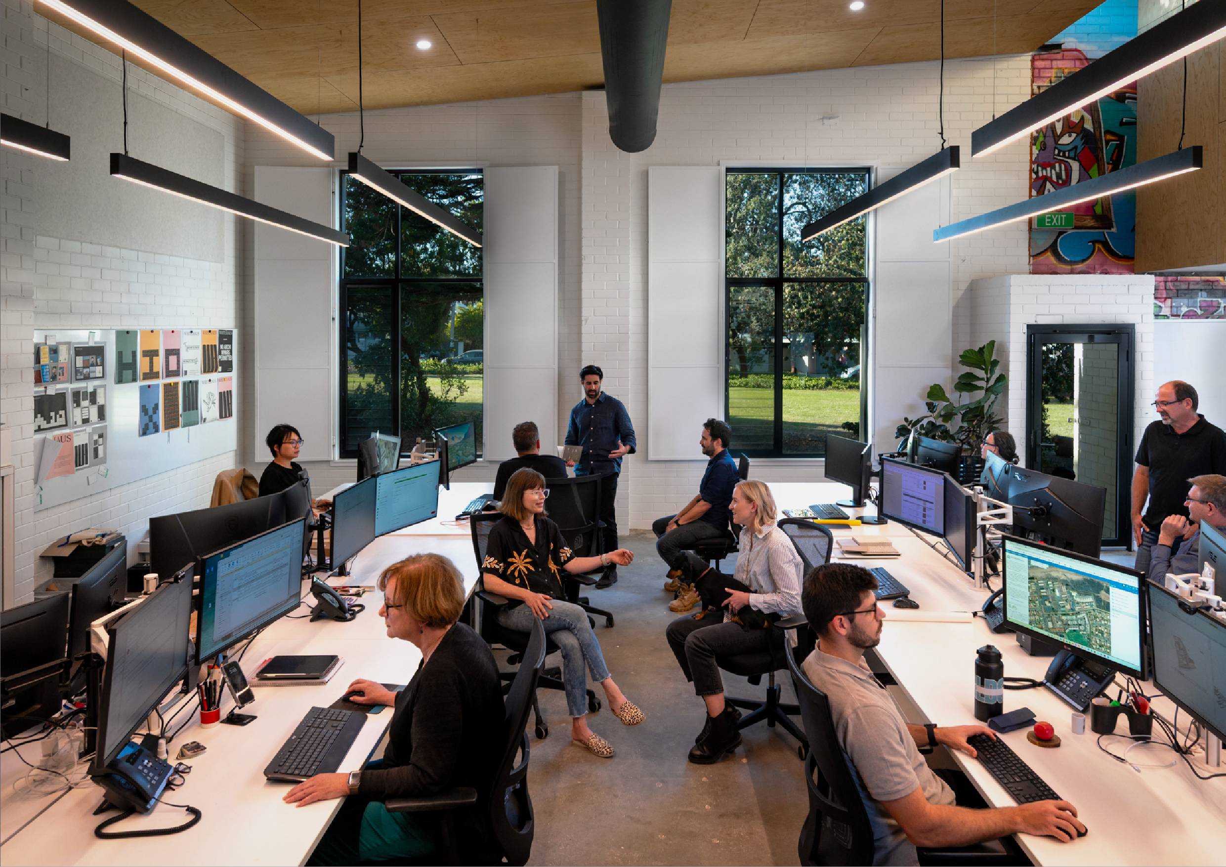
Delivering Untold Value
Great branding isn't decoration – it's a commercial imperative. We build distinctive brand systems and assets that create genuine competitive advantage through these four essentials.
Meaning
Every mark, every word, every choice carries intention. We uncover what matters most to your practice and create a coherent visual and verbal system that resonates authentically.
Relevance
Your brand should speak to the moment - understanding both your clients' evolving expectations and the broader cultural context
in which architecture operates today.
Context
We map the competitive landscape meticulously. Where are the gaps? Where's the noise? Your
brand needs to navigate this terrain with
confidence and clarity.
Difference
Distinction is non-negotiable. We identify and amplify what makes your practice genuinely unique—creating assets that allow you to occupy your own space in the market with authority.
Selected Works
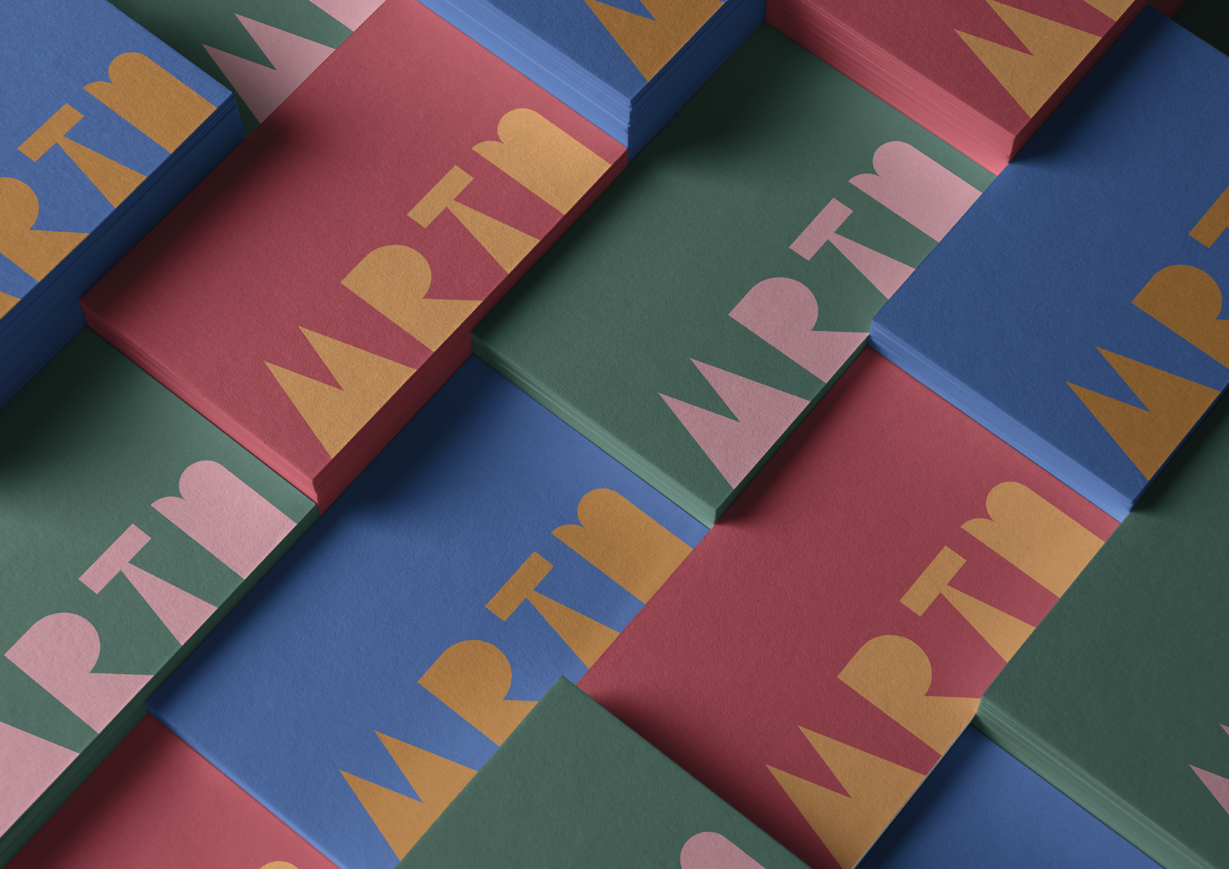
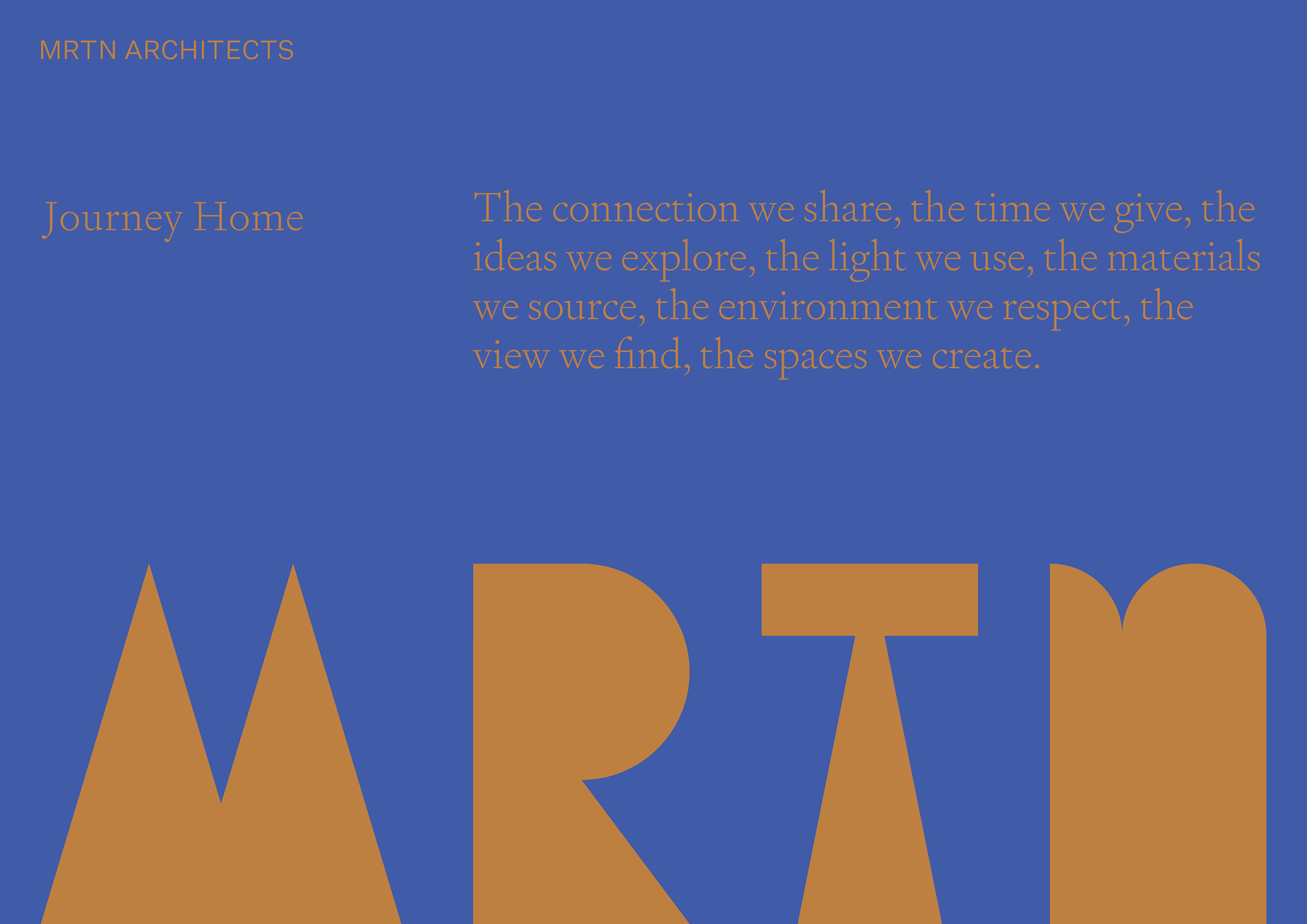
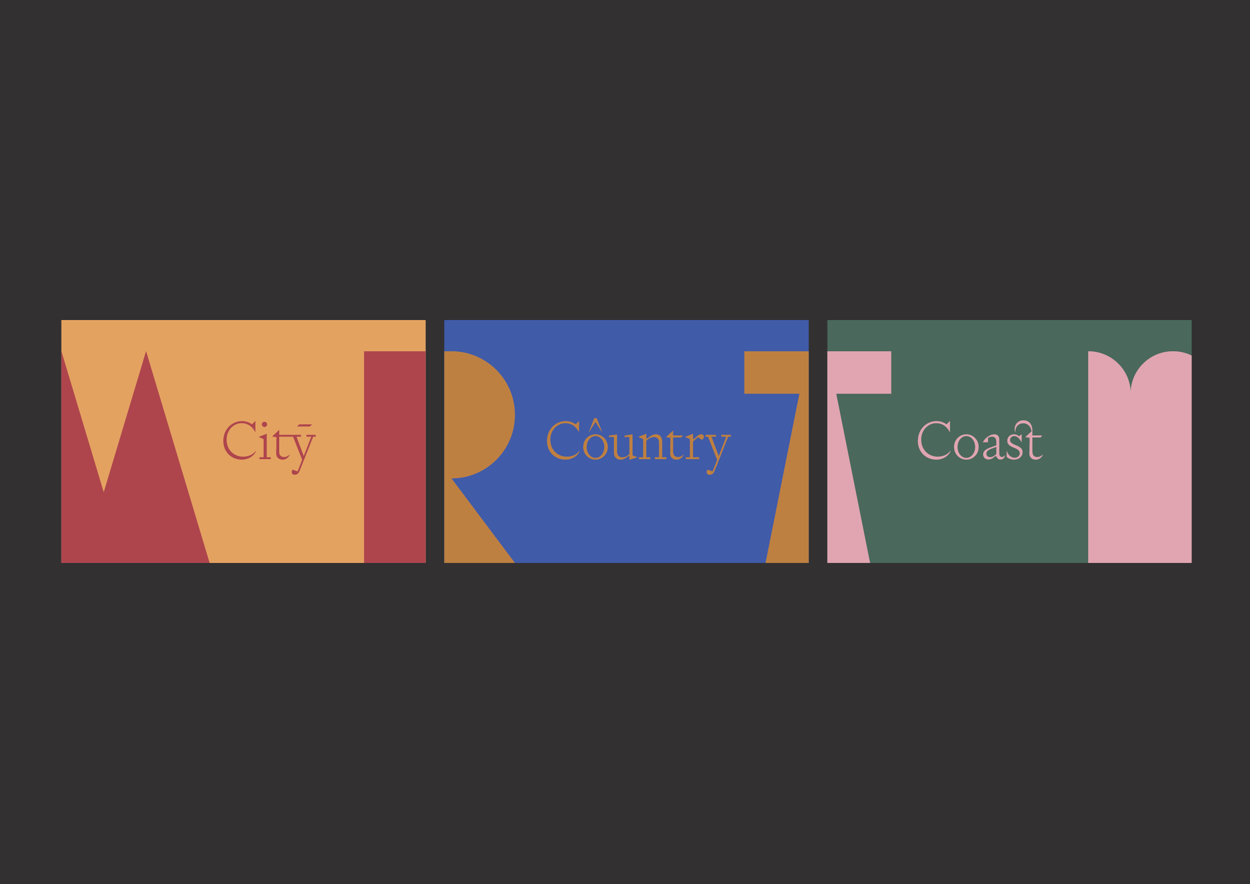
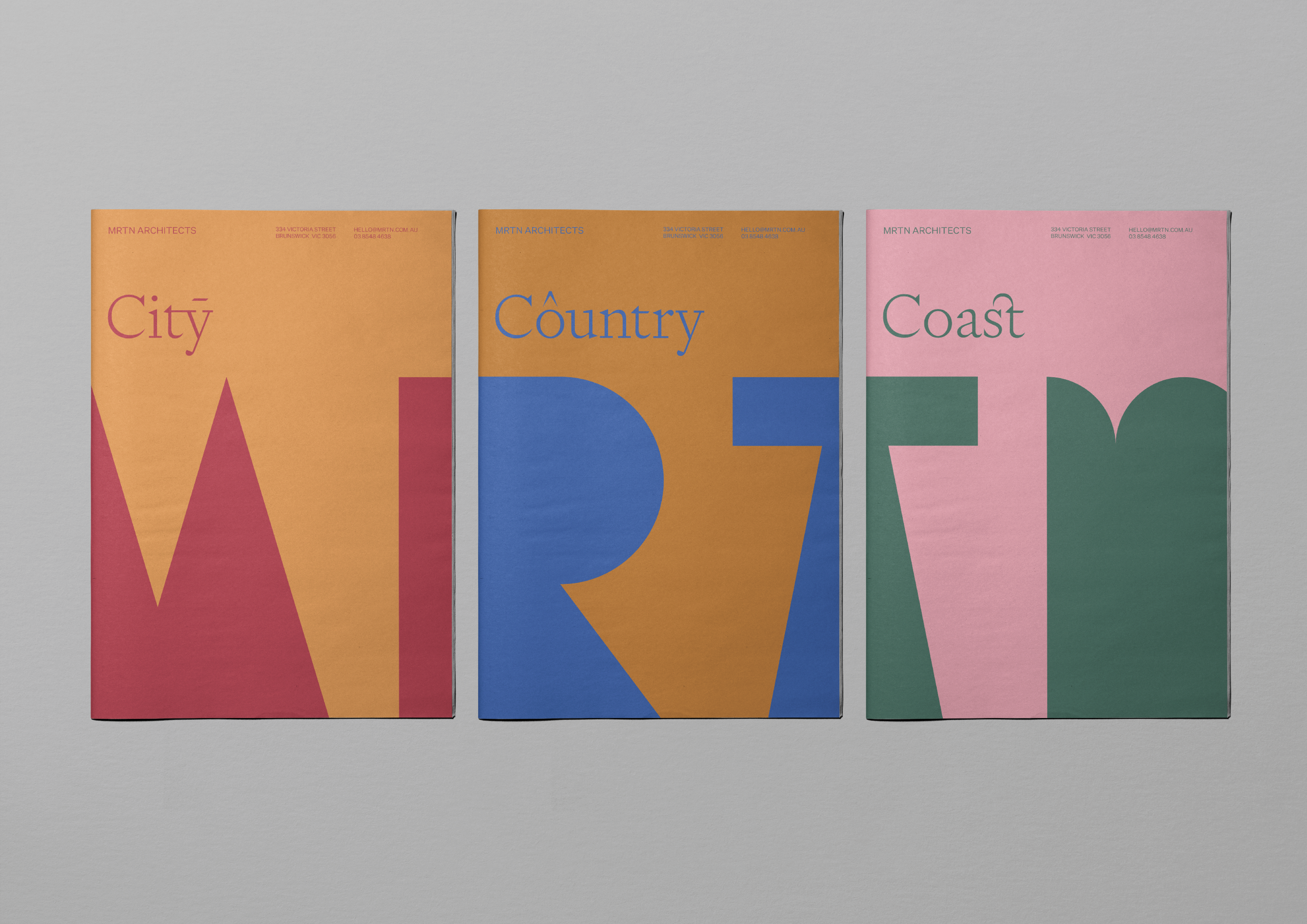
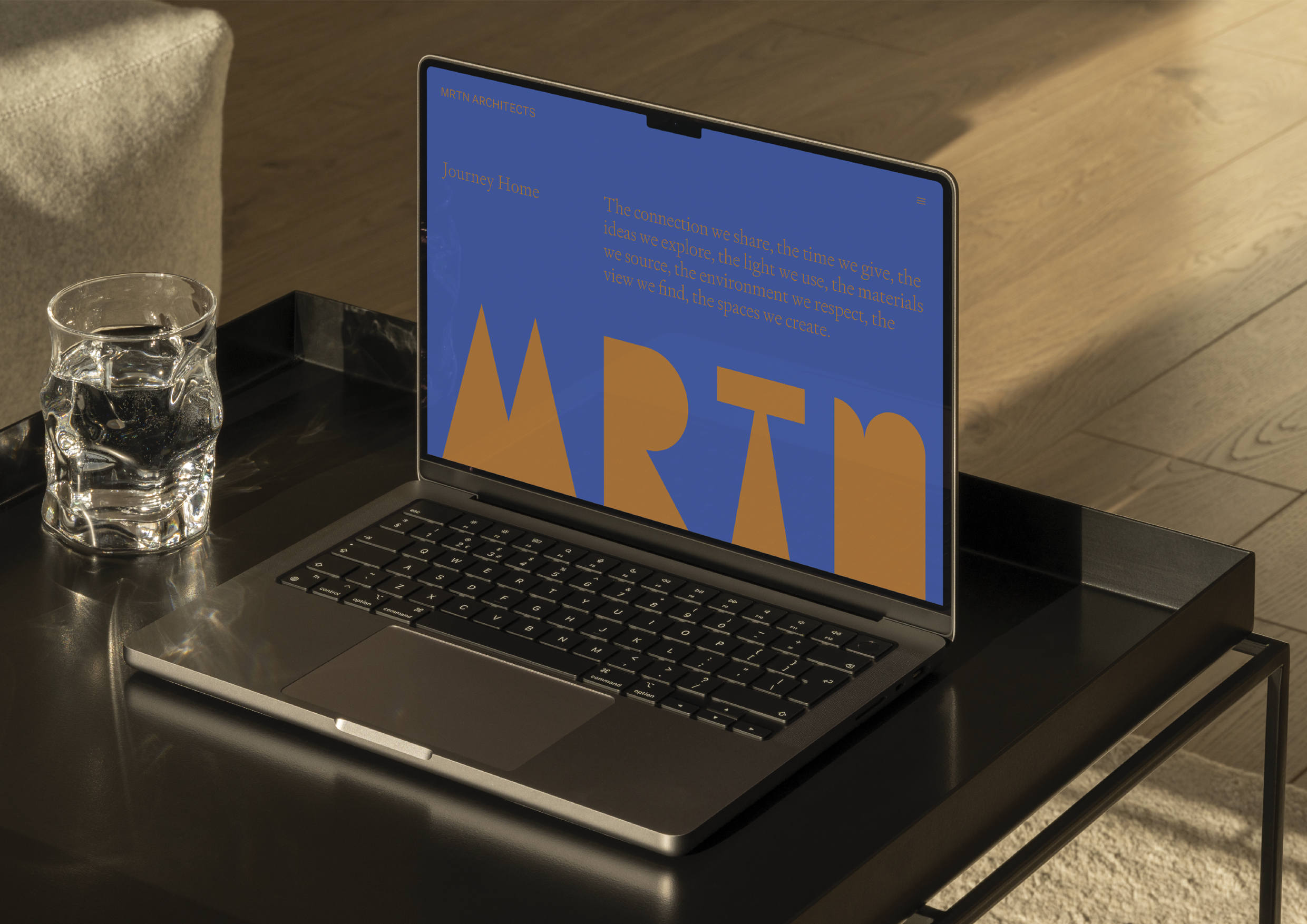
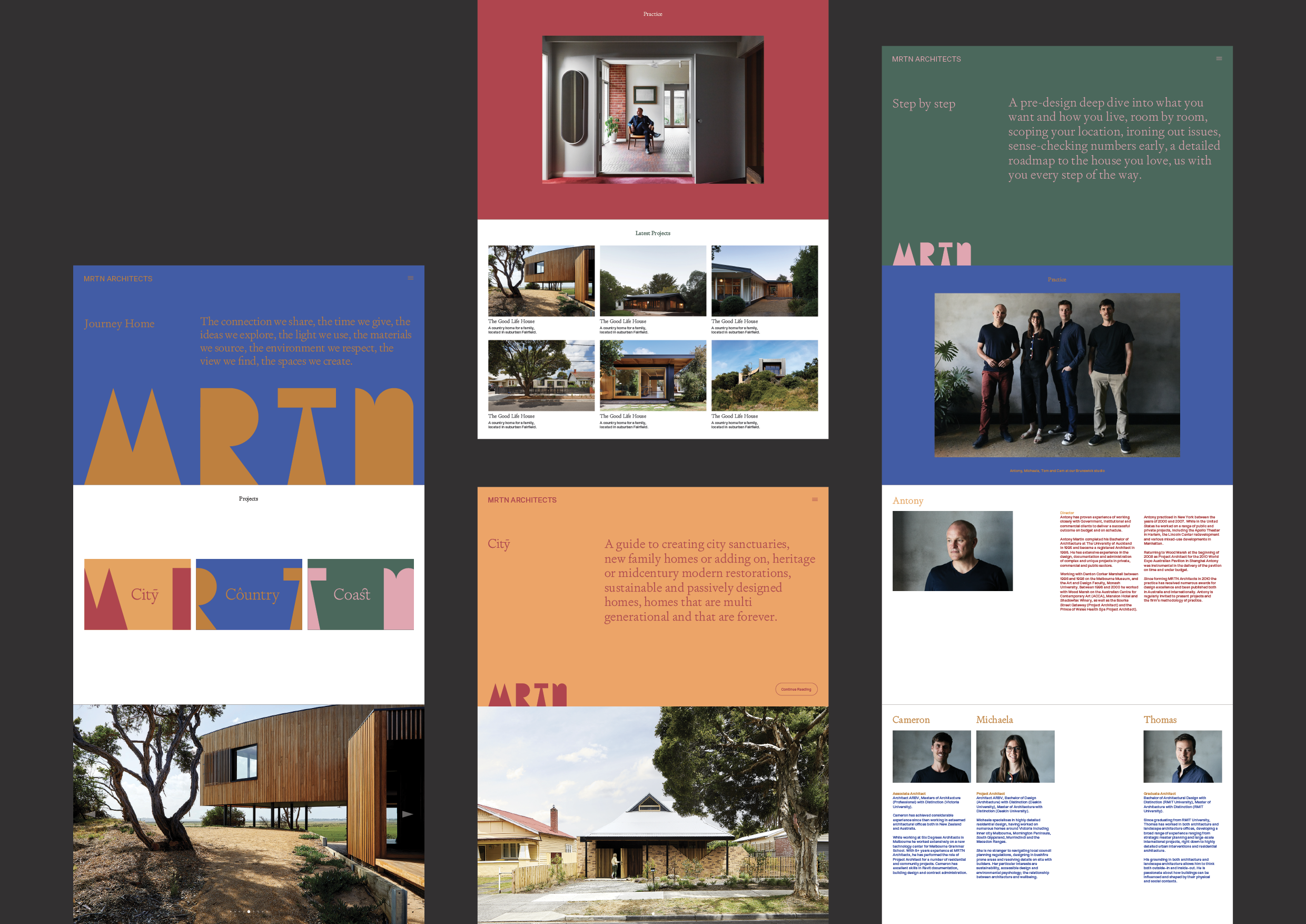
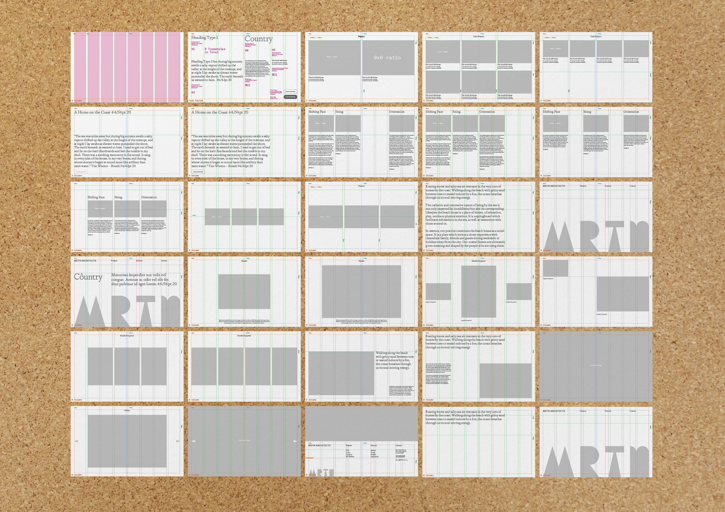
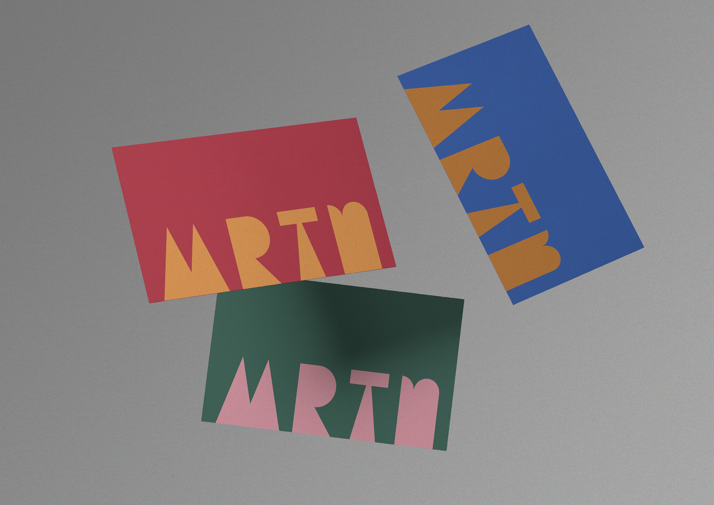
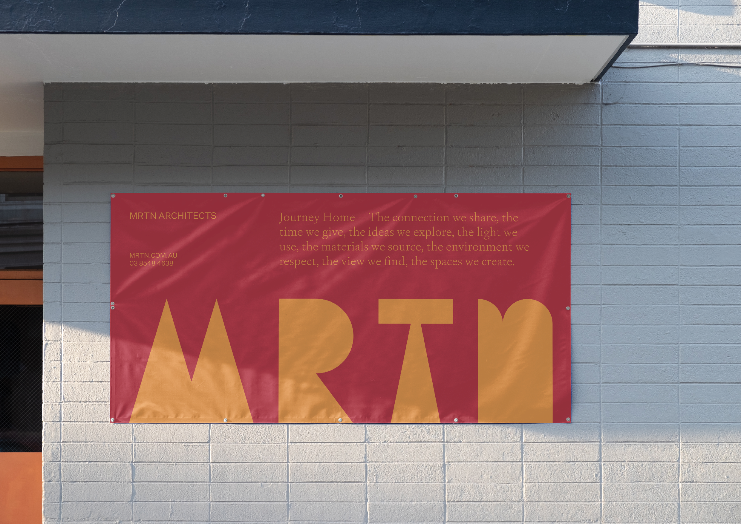
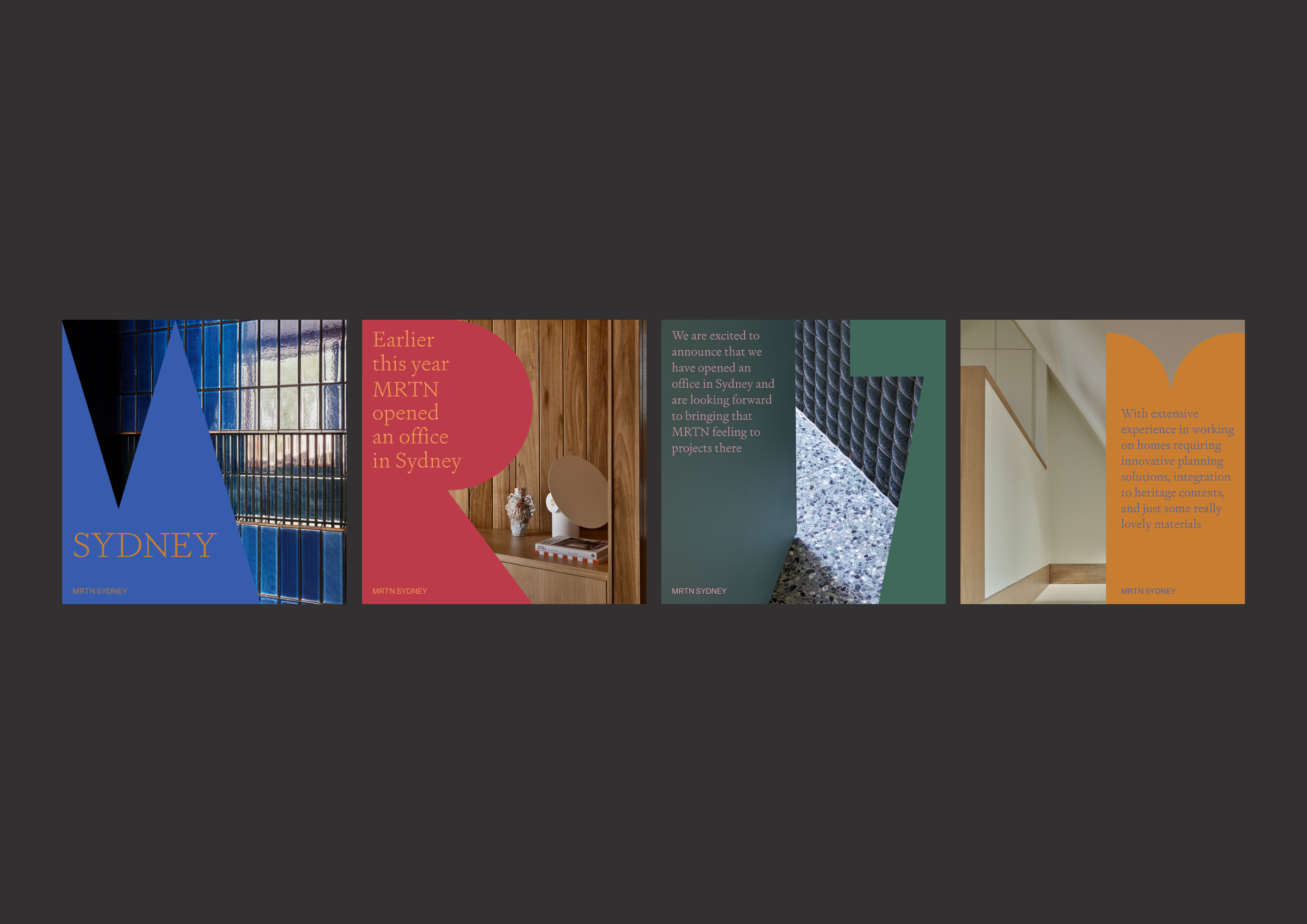
MRTN Architects
– Journey Home
We delivered a complete brand identity – both visual and verbal – alongside a residential positioning framework: City, Country, Coast. It's a project we're particularly pleased with. The deliverables give the practice a platform that's both relevant and genuinely distinctive – allowing them to occupy their own space in the market with confidence.
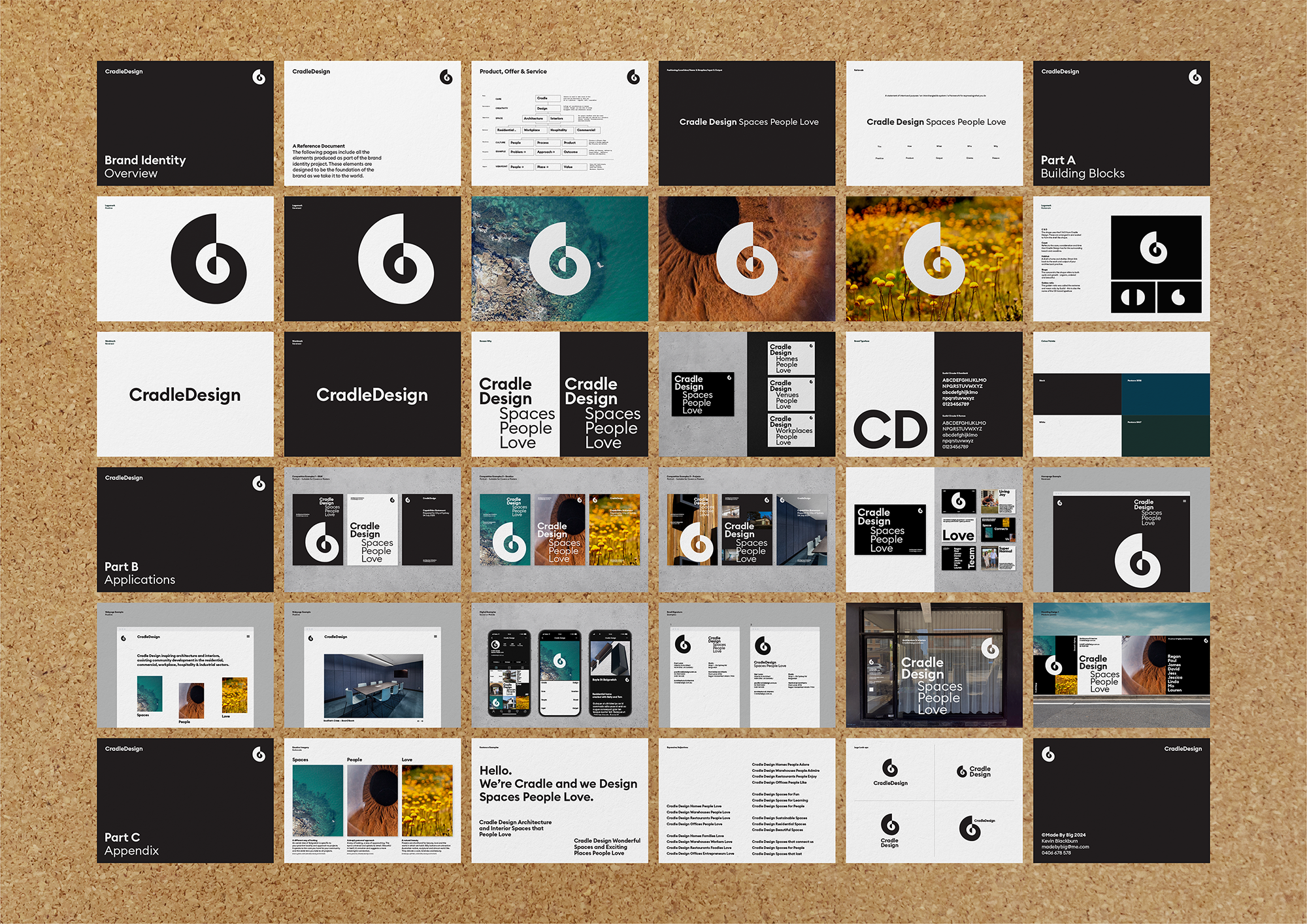
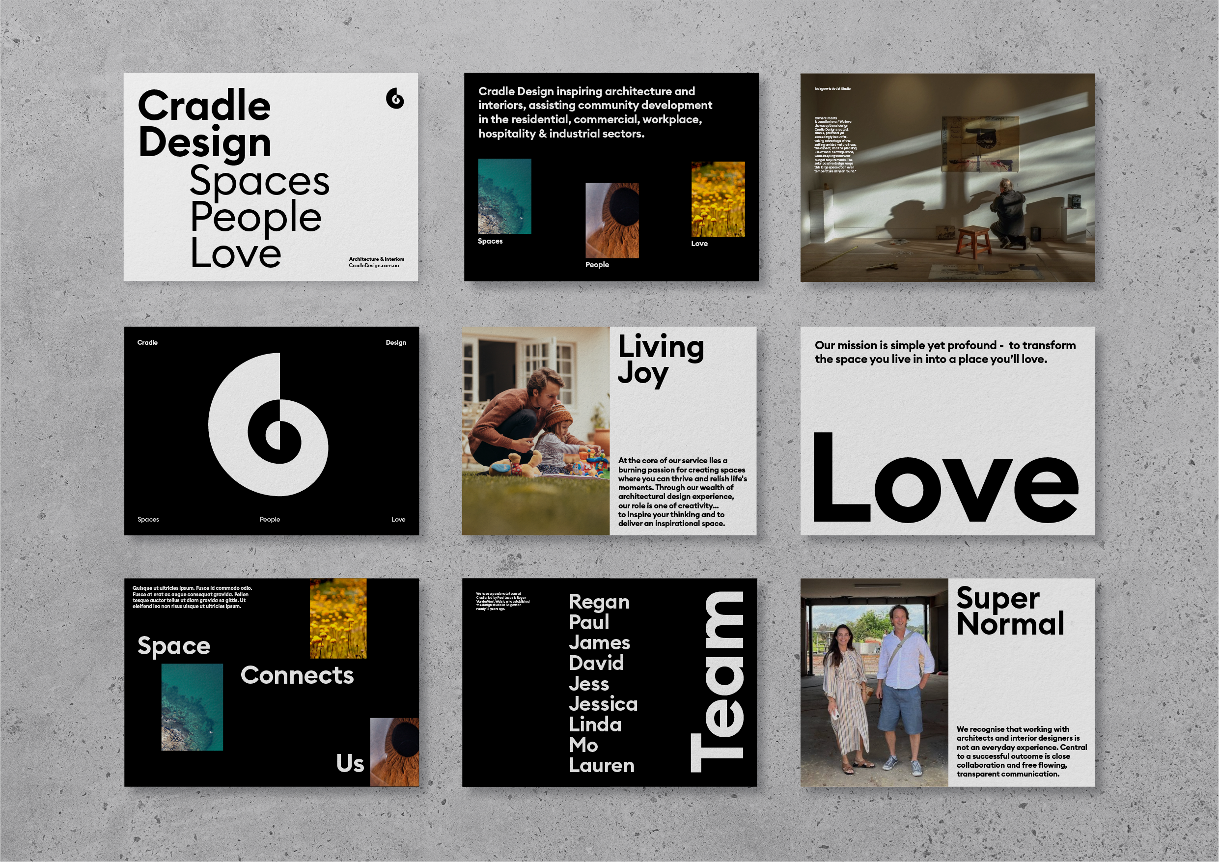
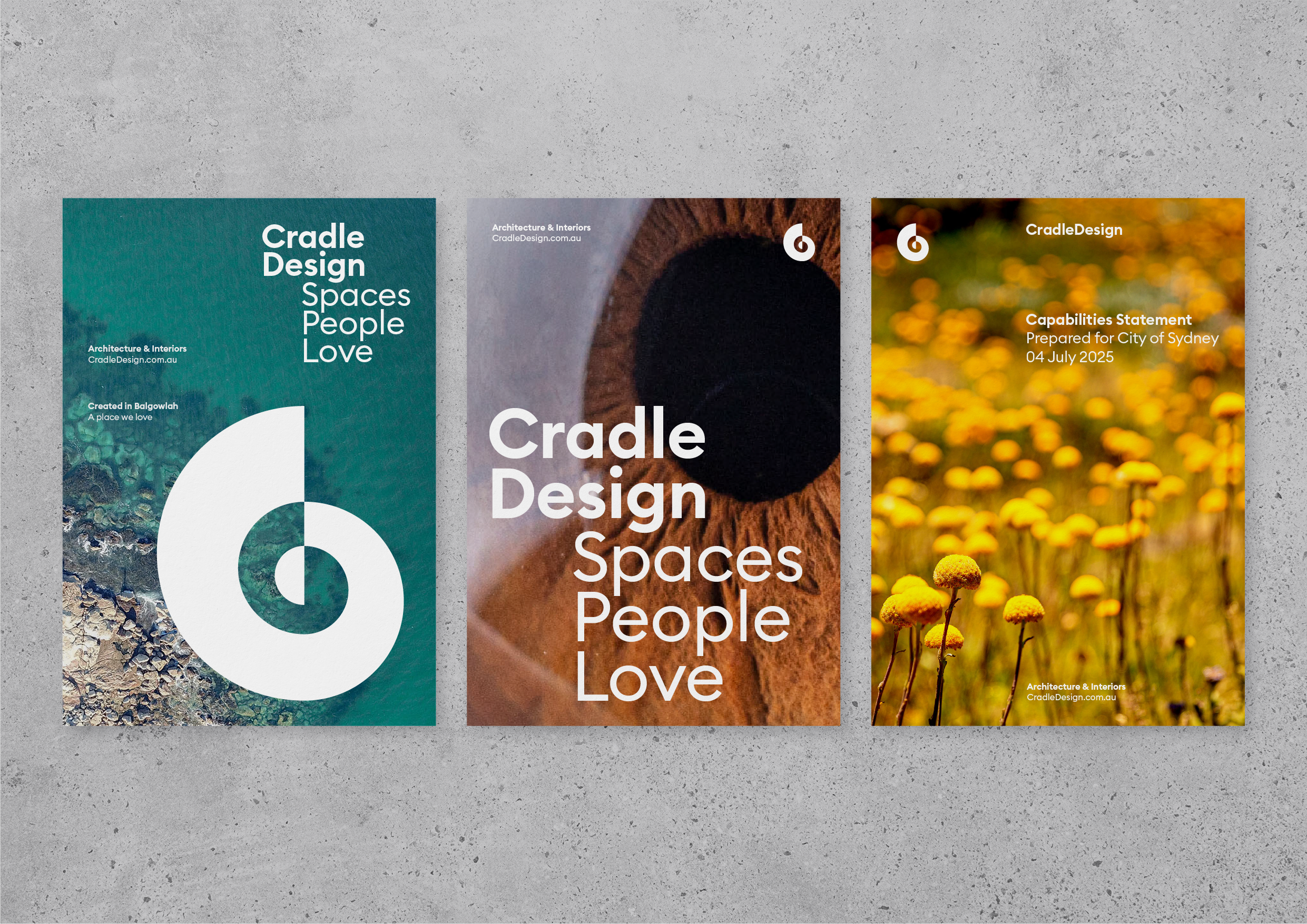
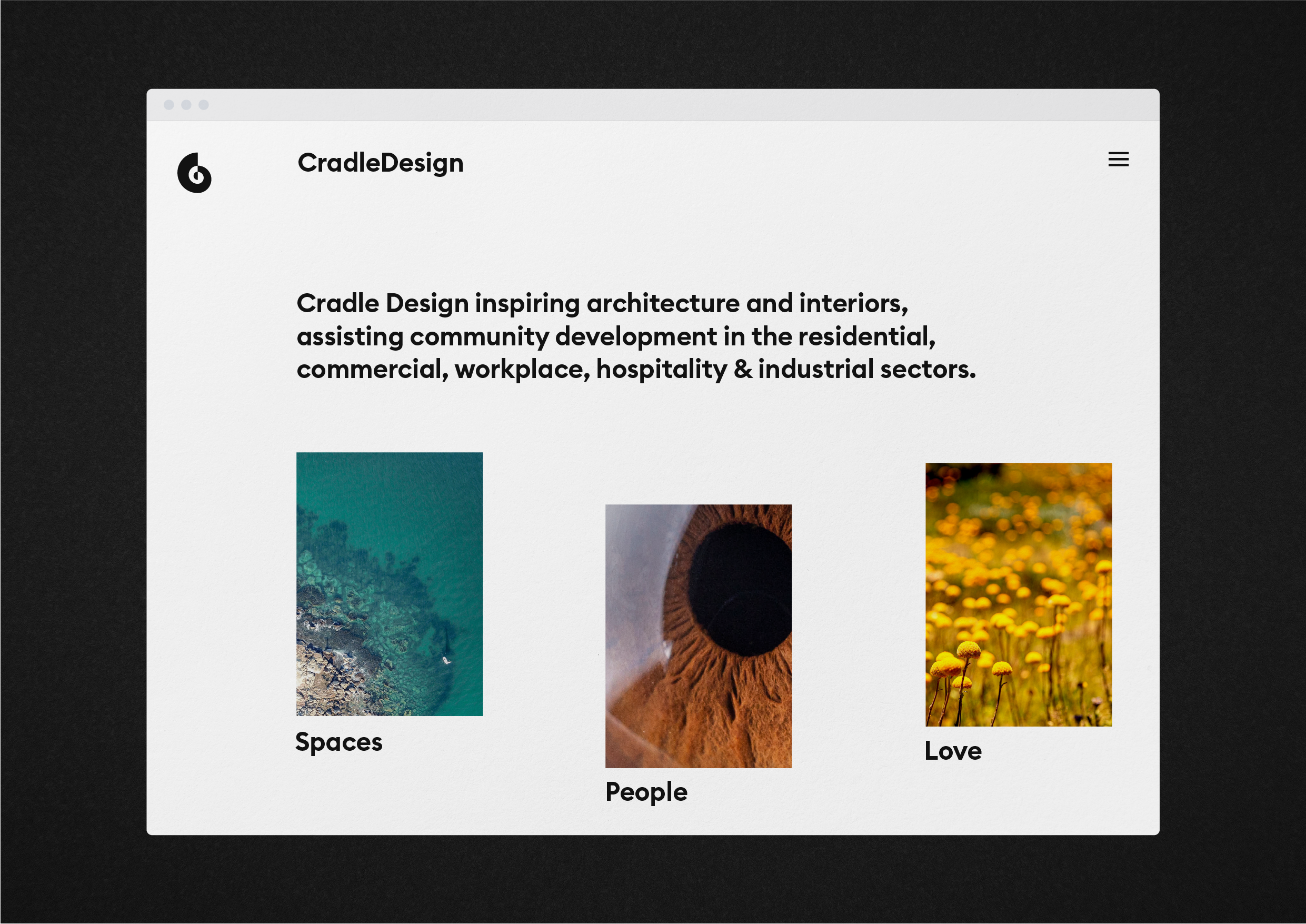
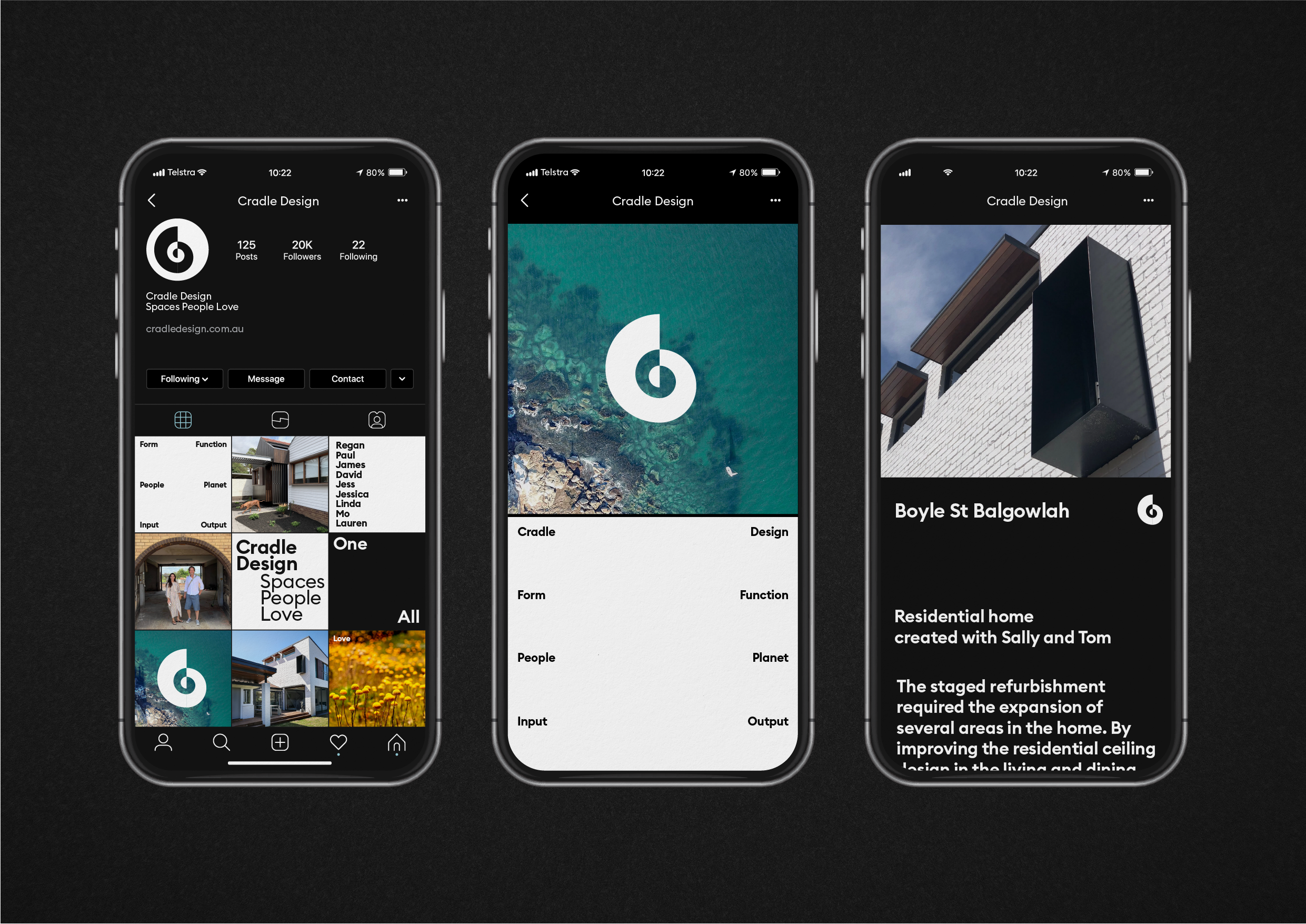
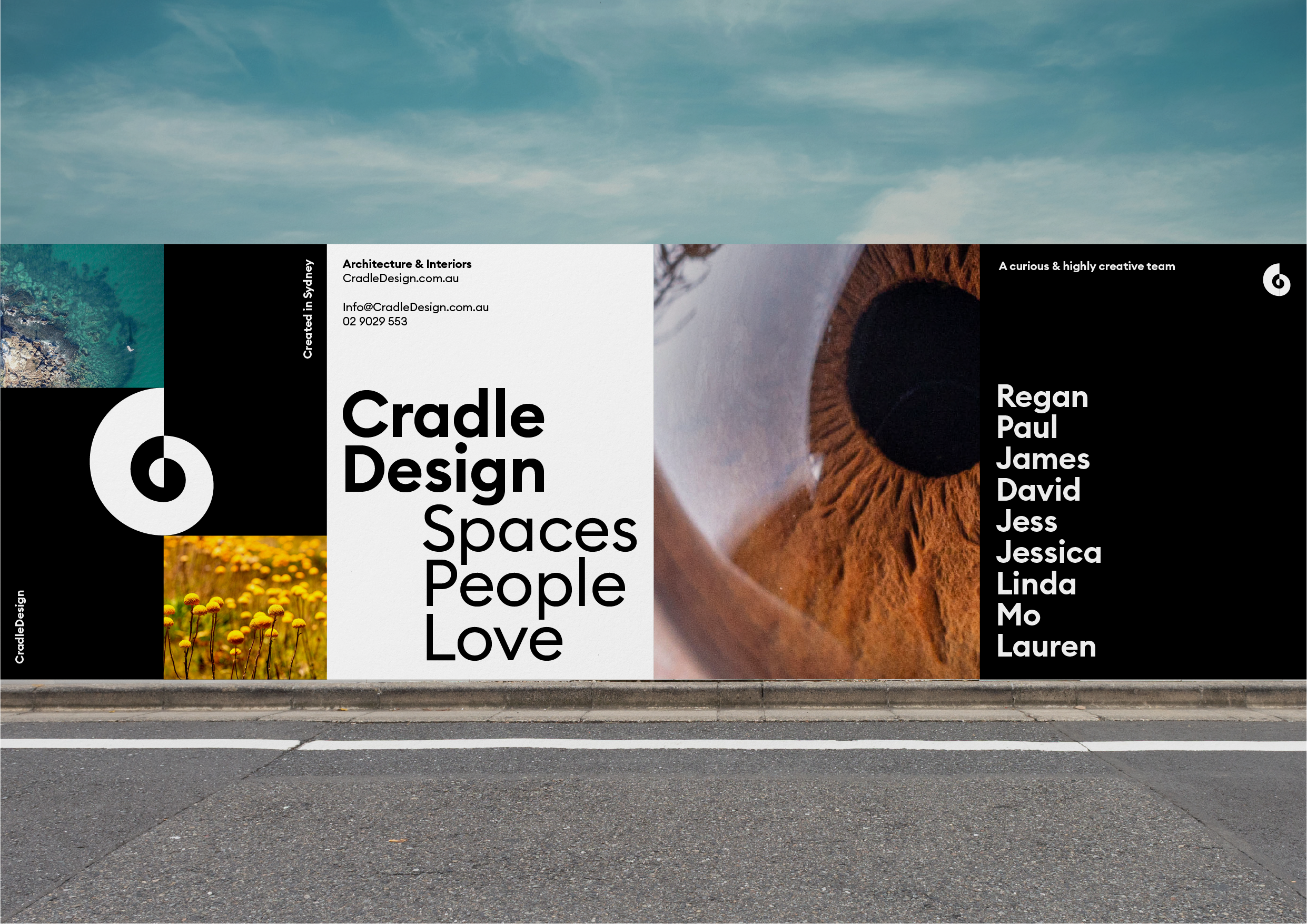
Cradle Design
– Spaces People Love
We repositioned Sydney architectural practice Cradle Design with a new identity system and creative platform. The core idea transforms their name into an interchangeable framework: "Cradle Design Spaces People Love." This positions the practice around three clear elements – the what (spaces), the who (people), and the why (love) – creating a campaignable framework that adapts to any audience. The visual identity and logo extend this reductive thinking into a cohesive design language.

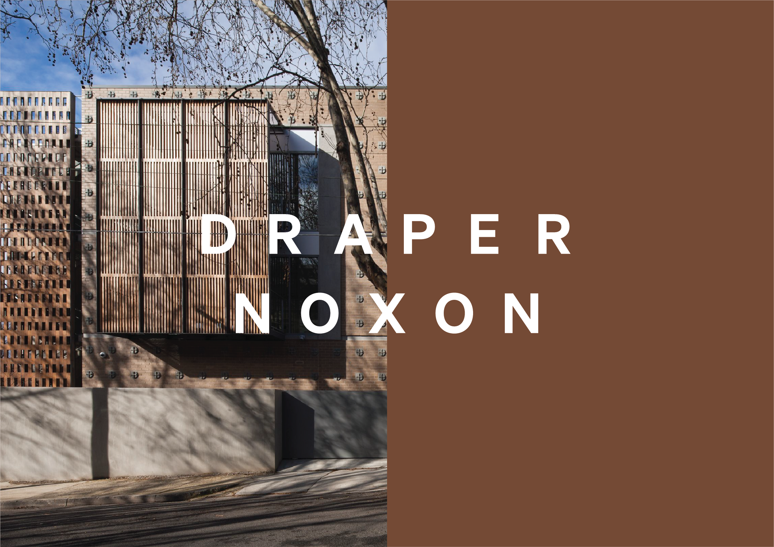
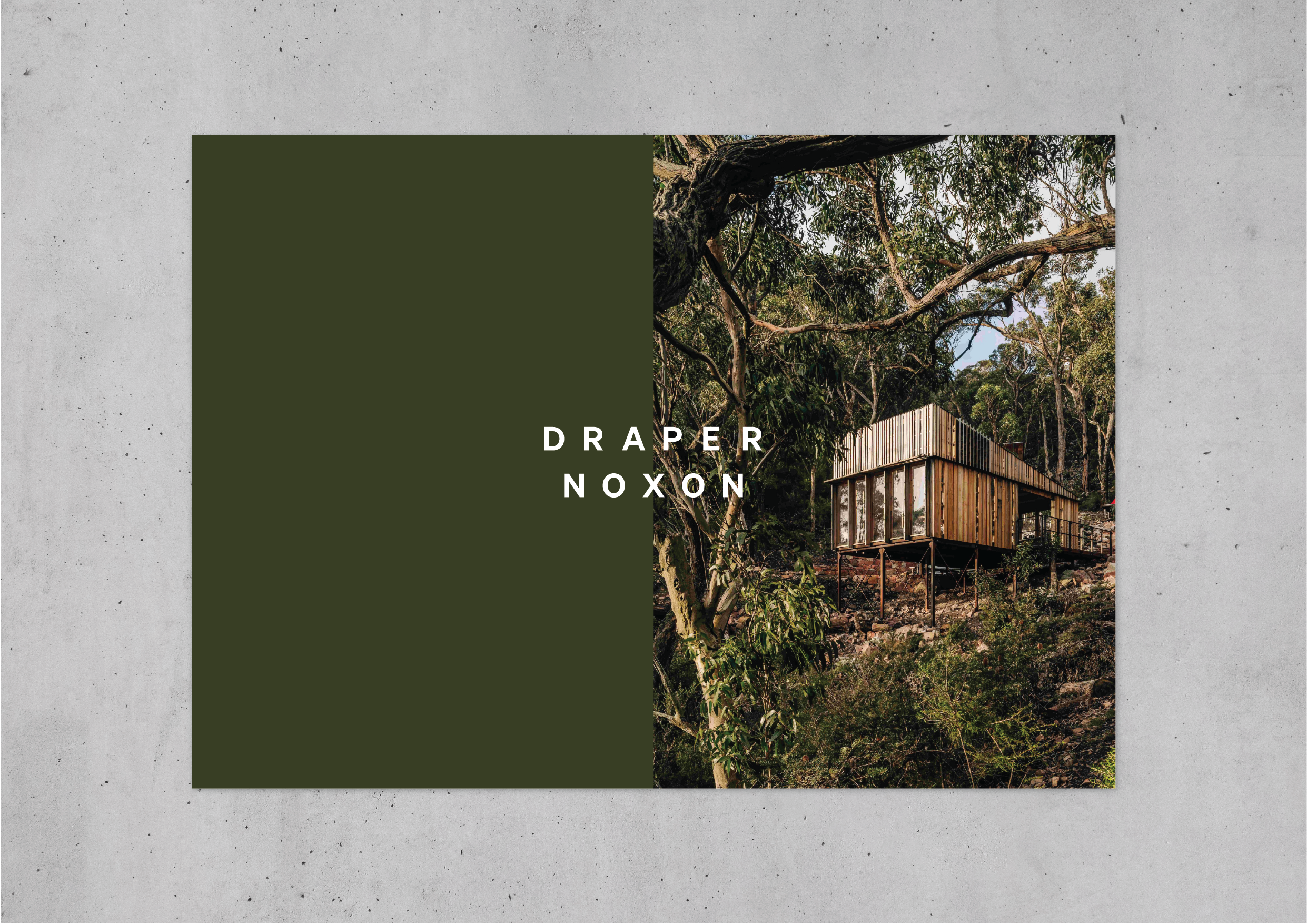
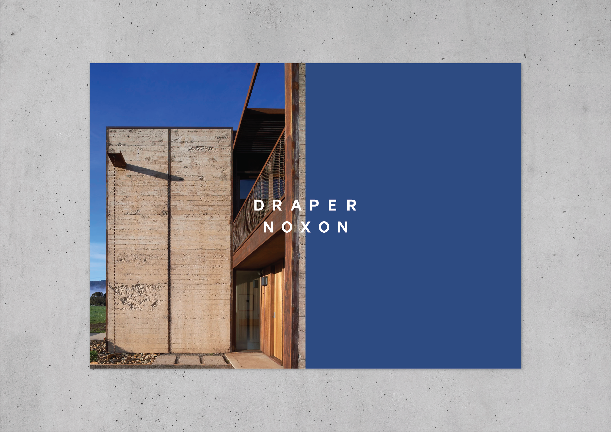
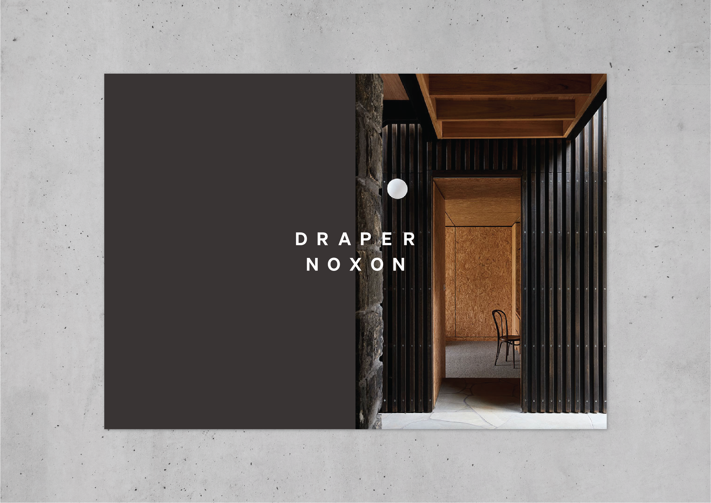
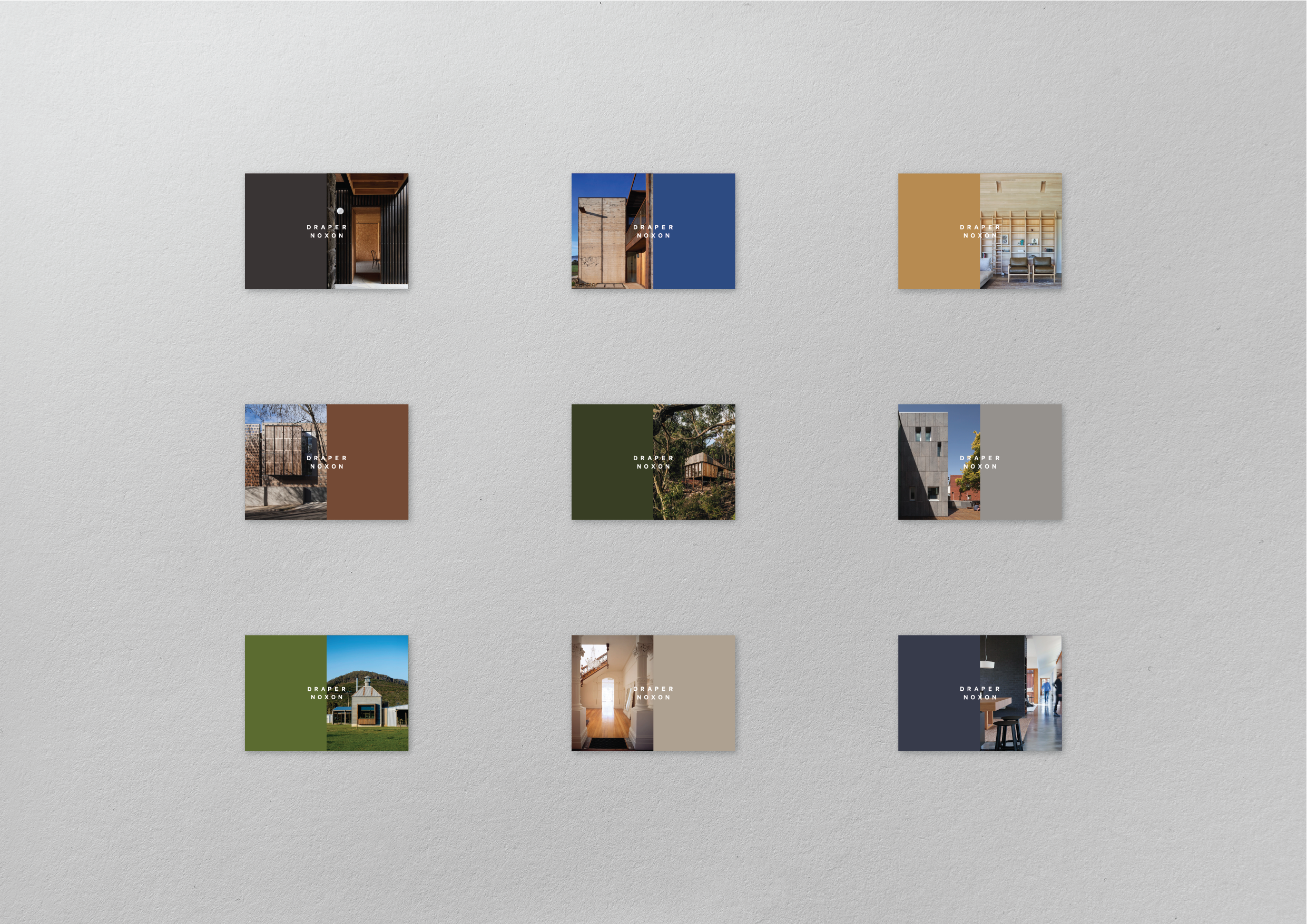
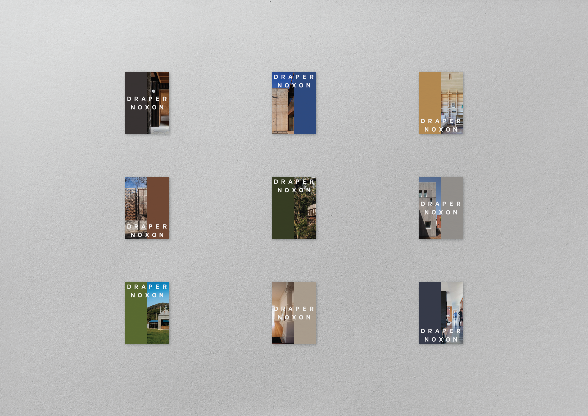
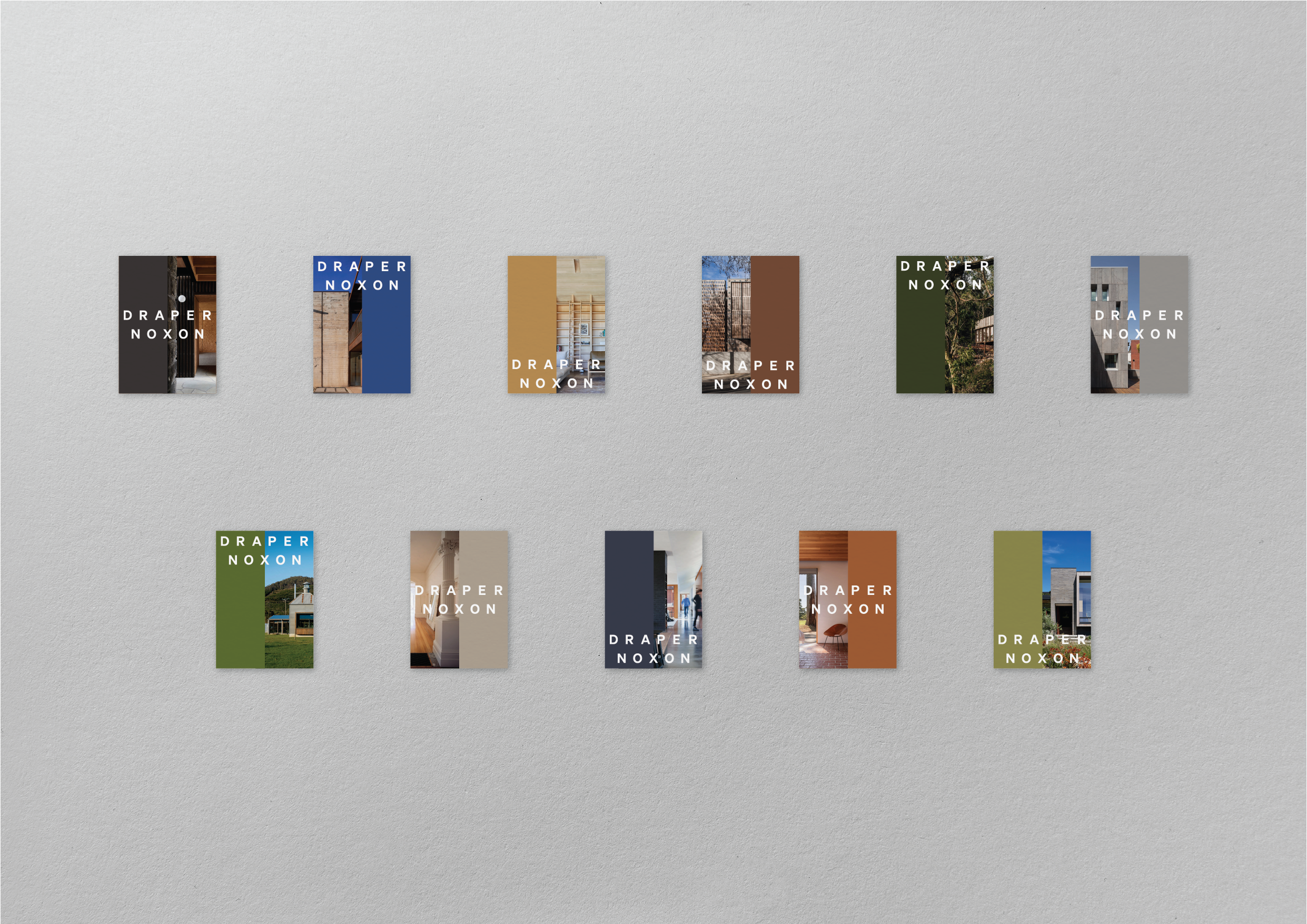
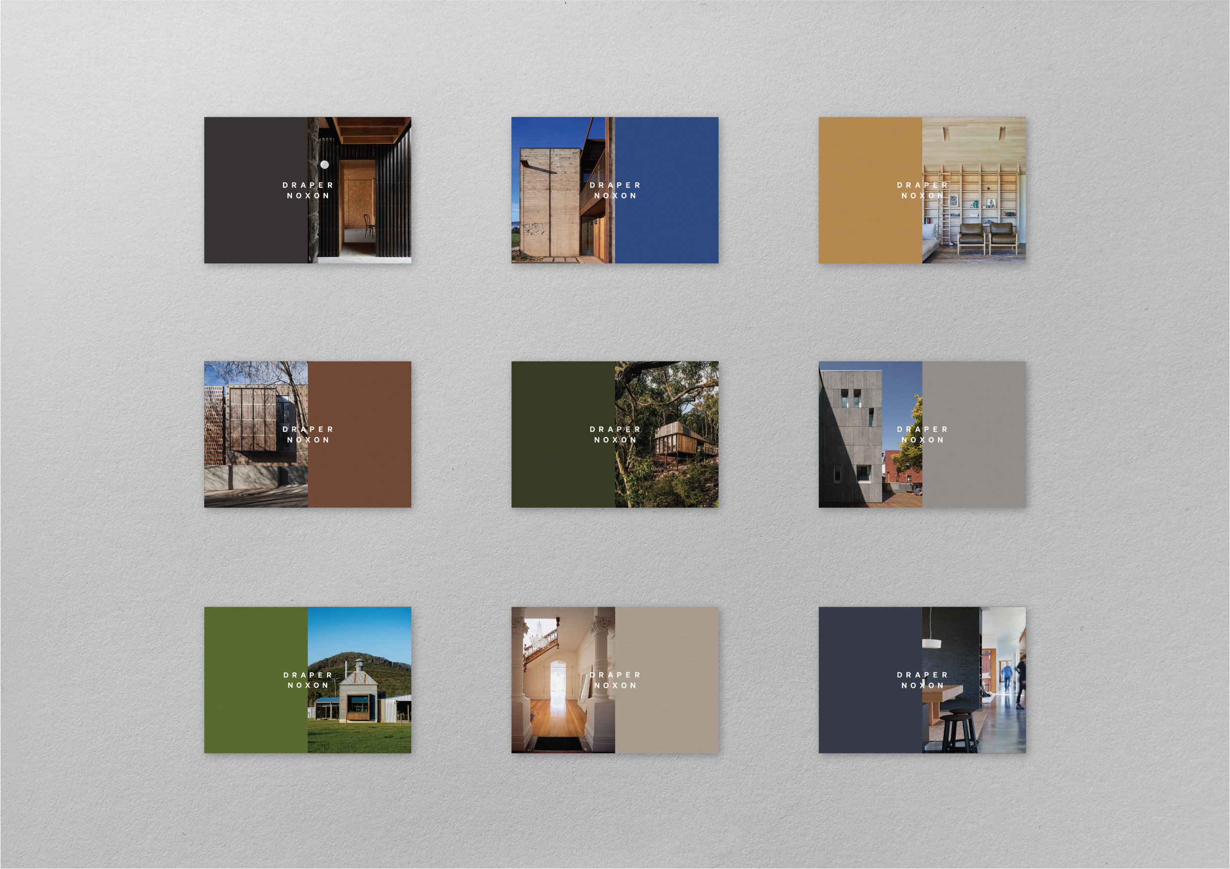
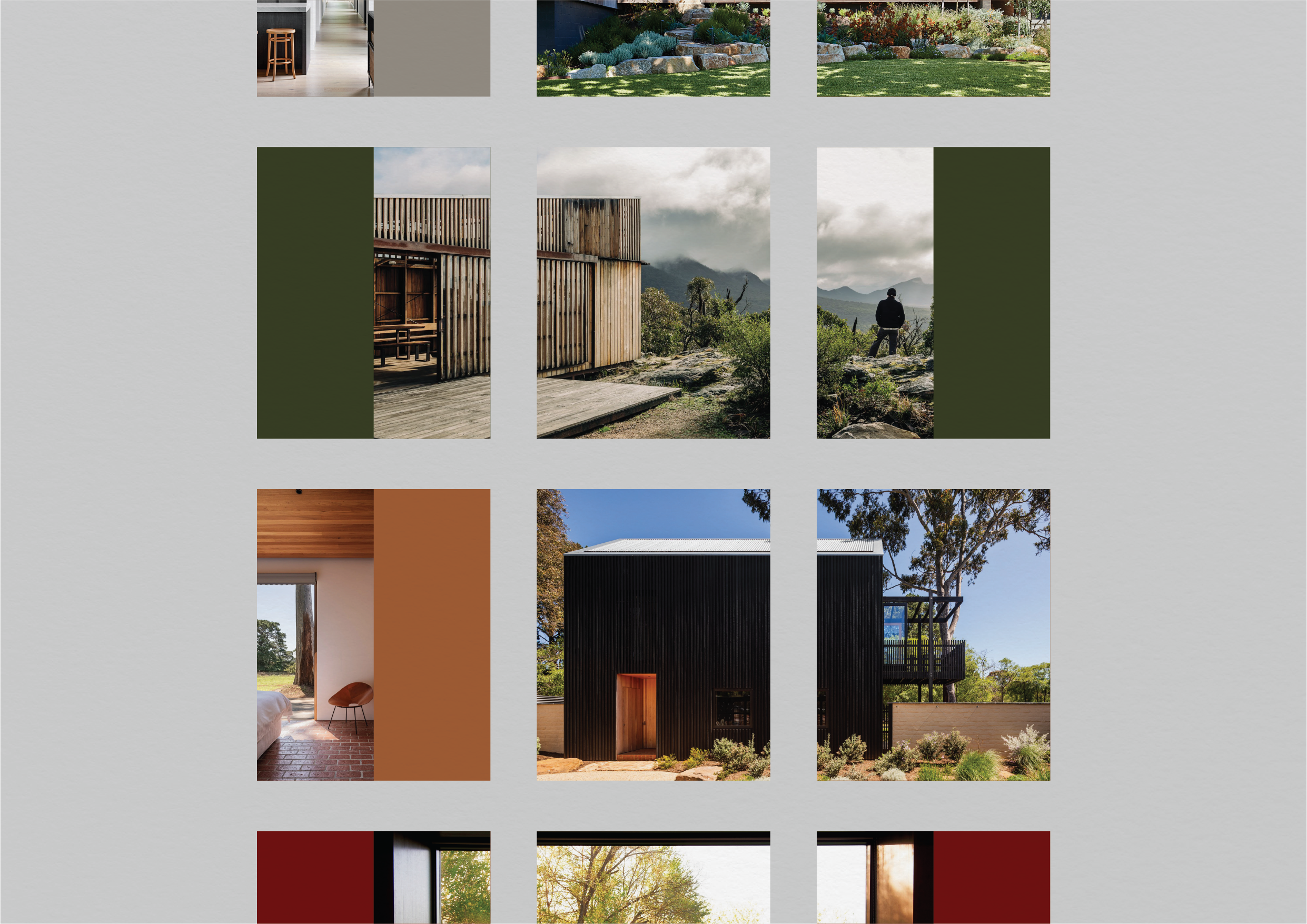
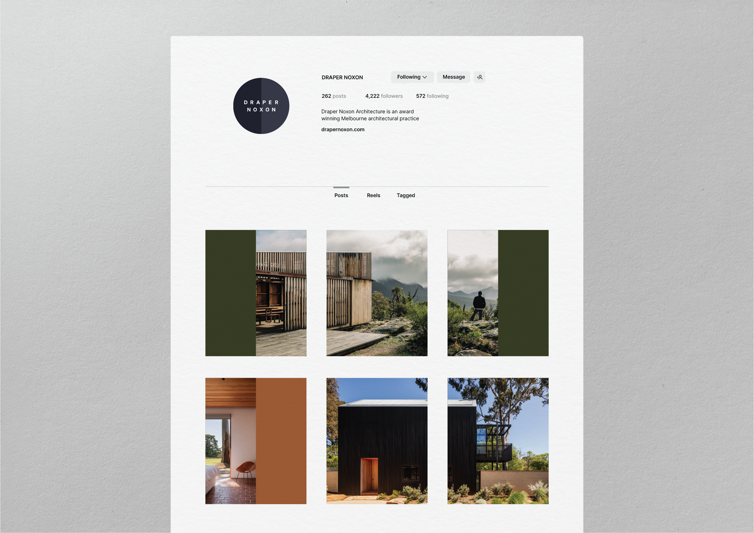
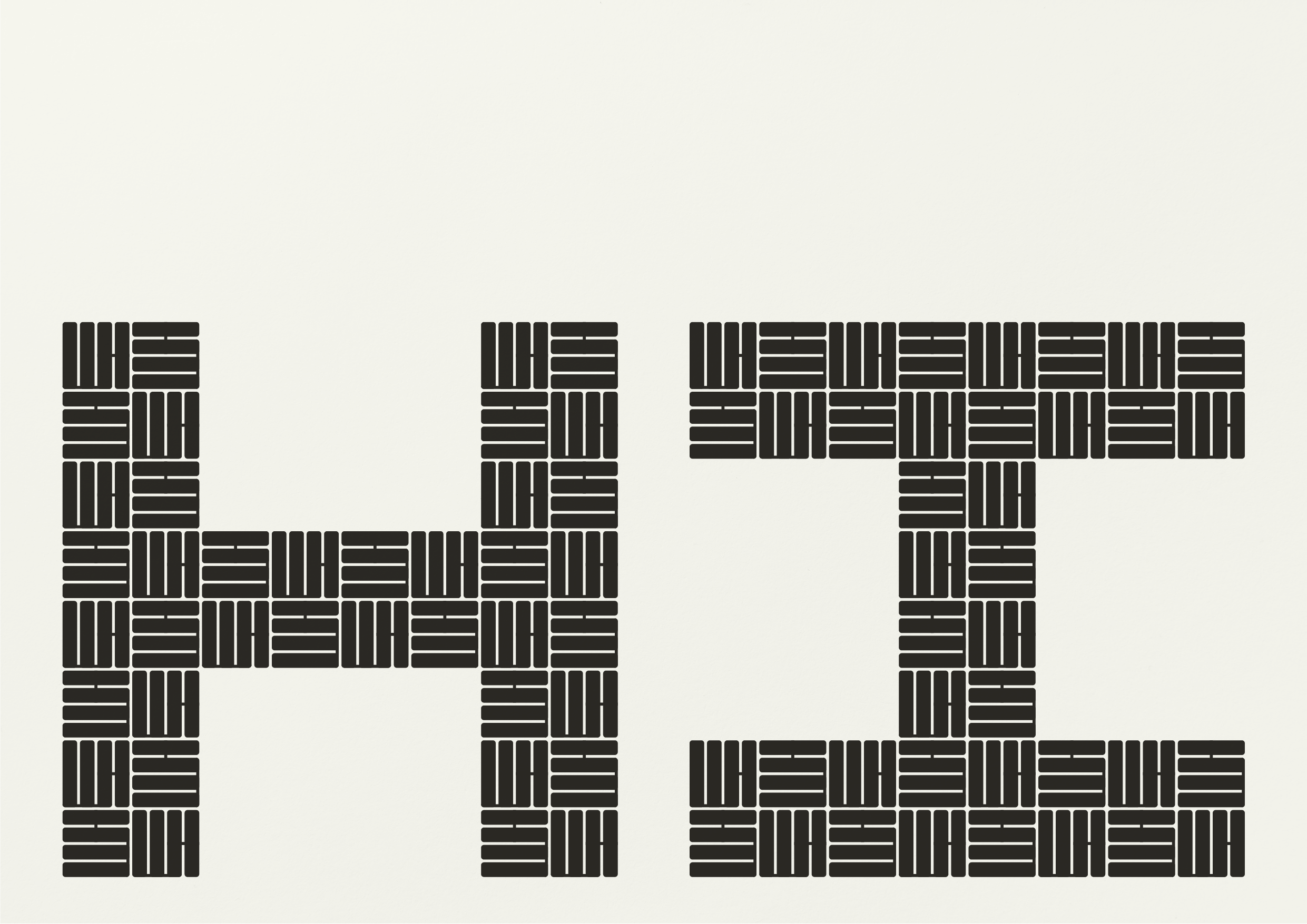
Draper Noxon Architects
– Duality
Completed last year for Justin and Sally – two highly regarded architects who merged to form DNA. The approach here was deliberately restrained, allowing the work itself to take centre stage. That said, we exploited a simple typographic opportunity: the equal number of letters and balanced spacing of the two surnames quietly references the partnership of its founders.


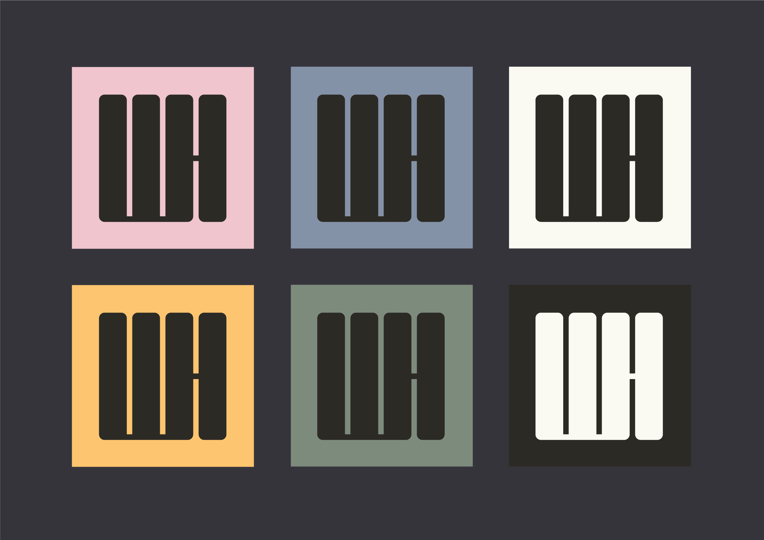
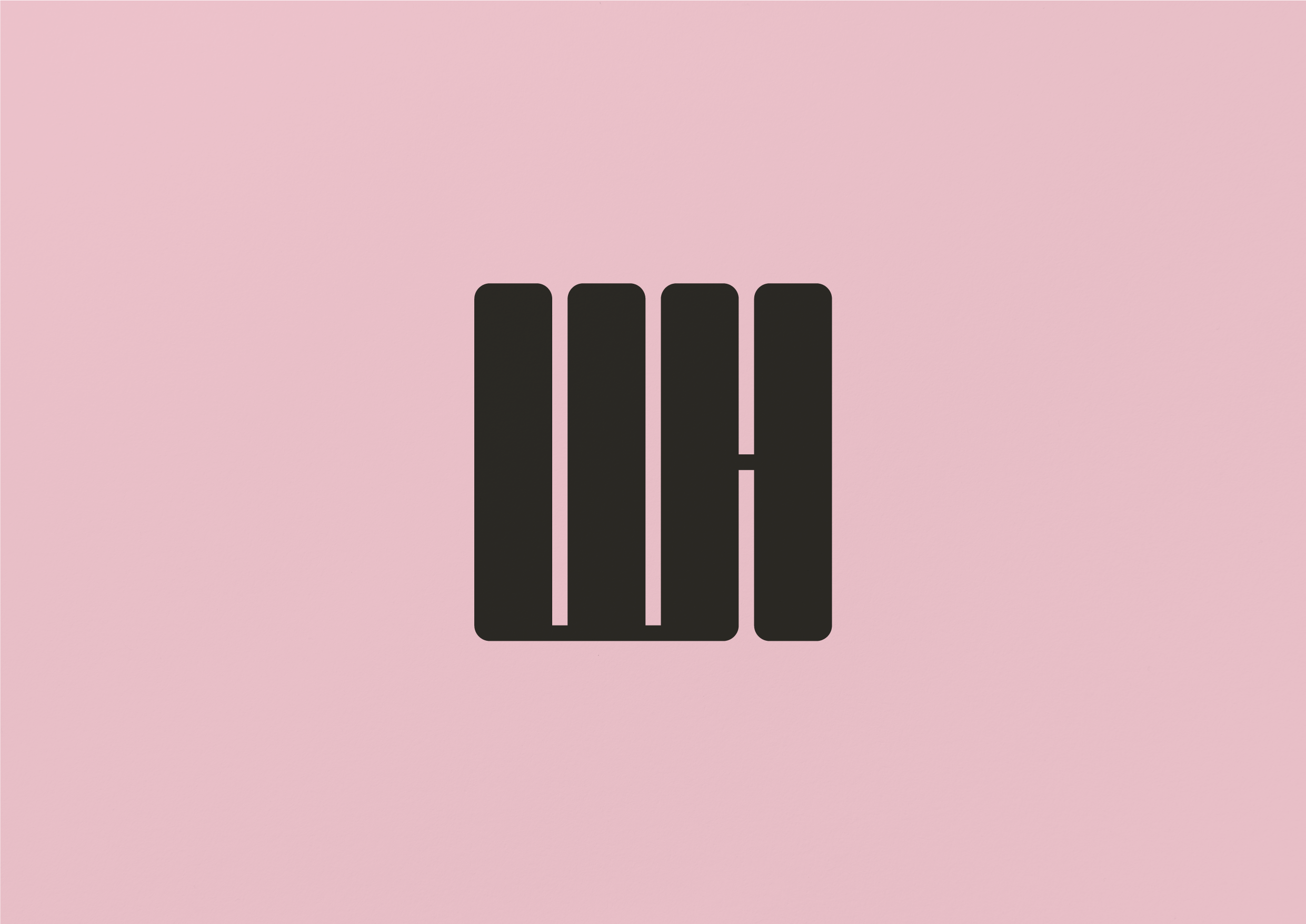
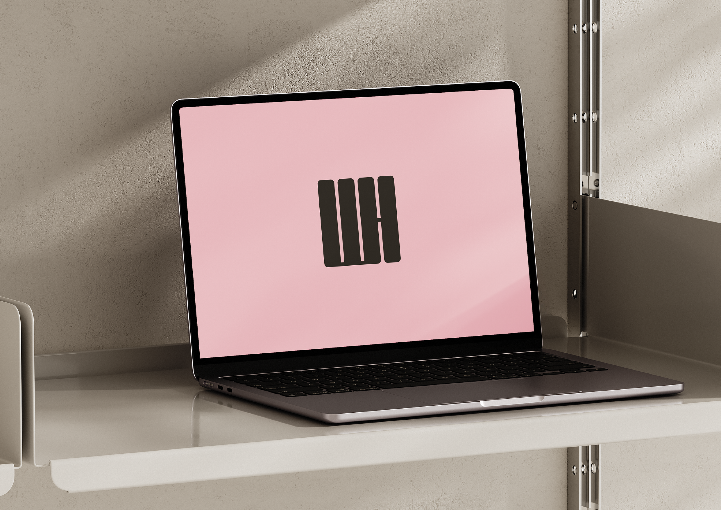
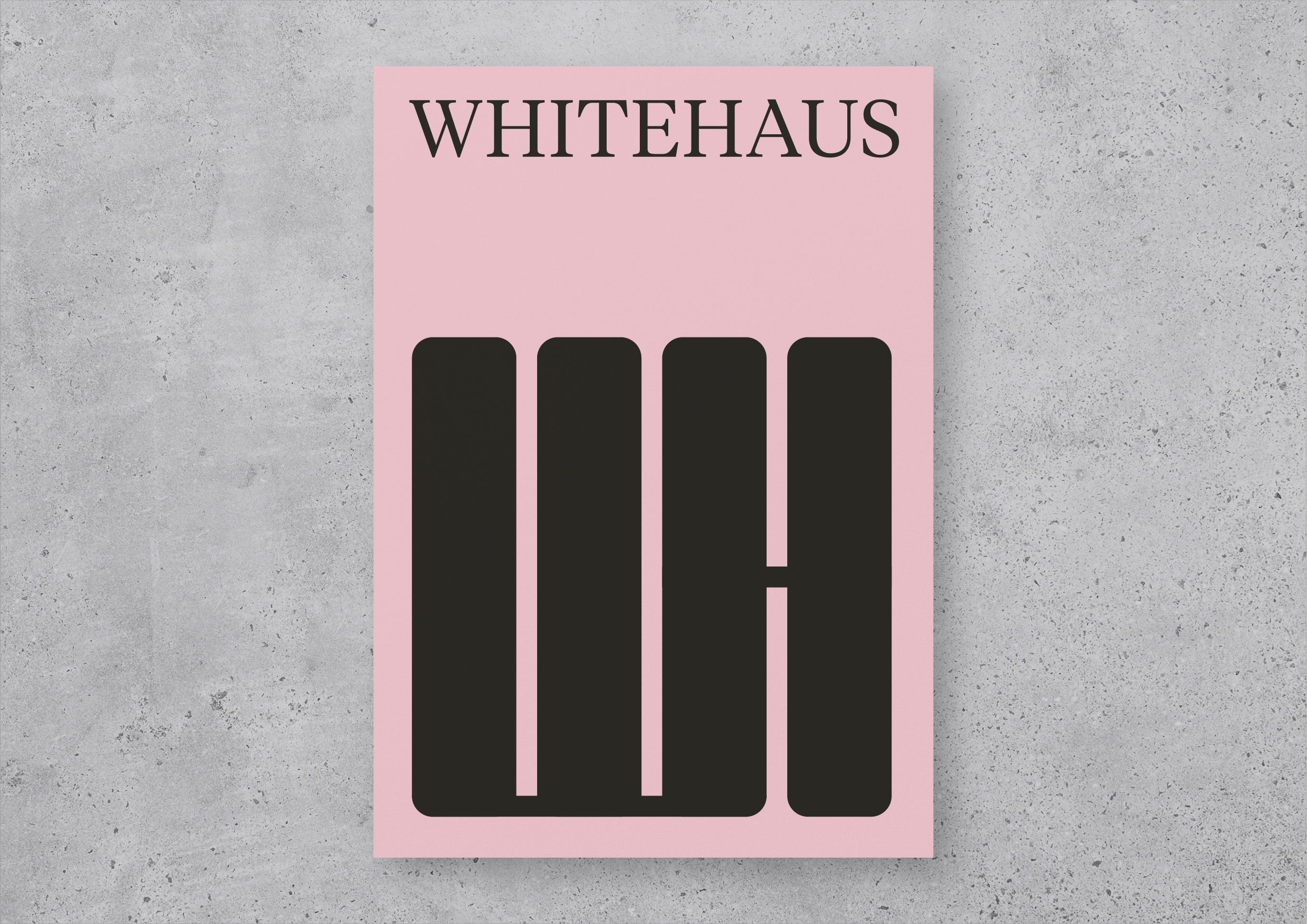
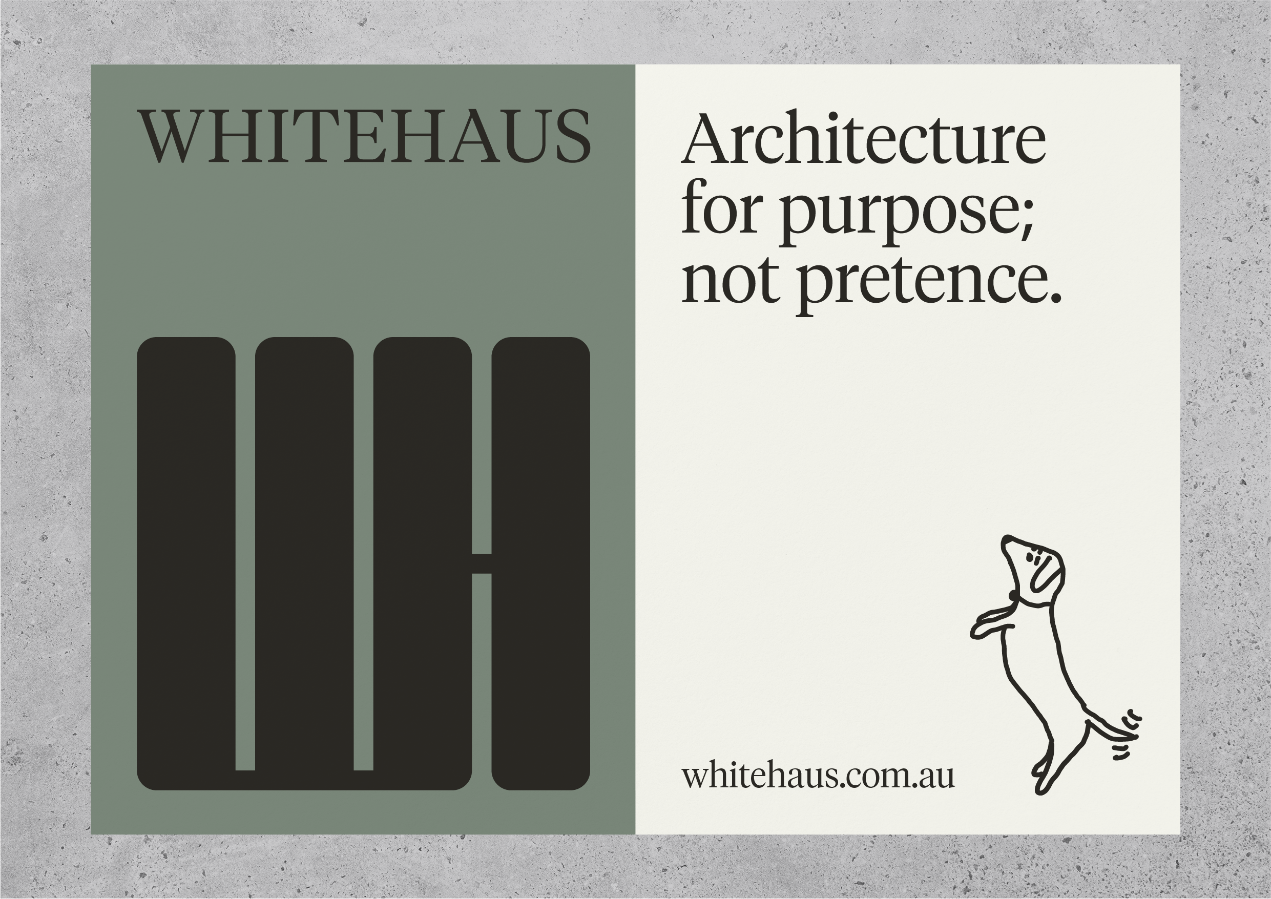
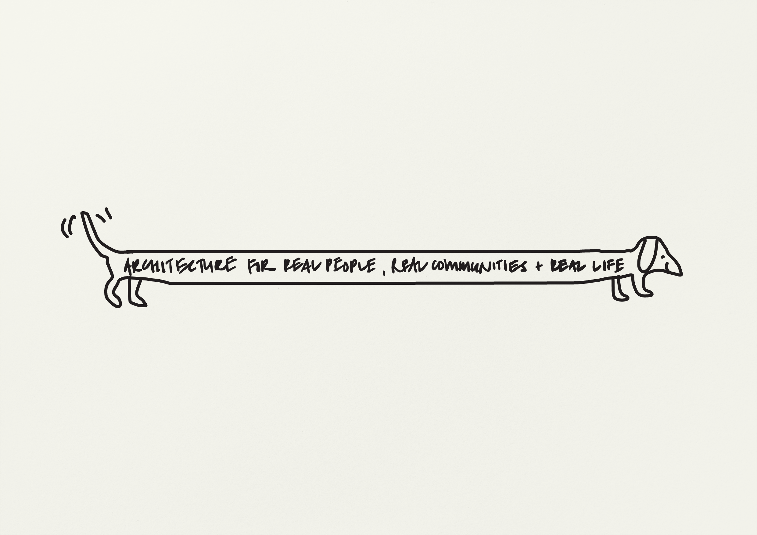
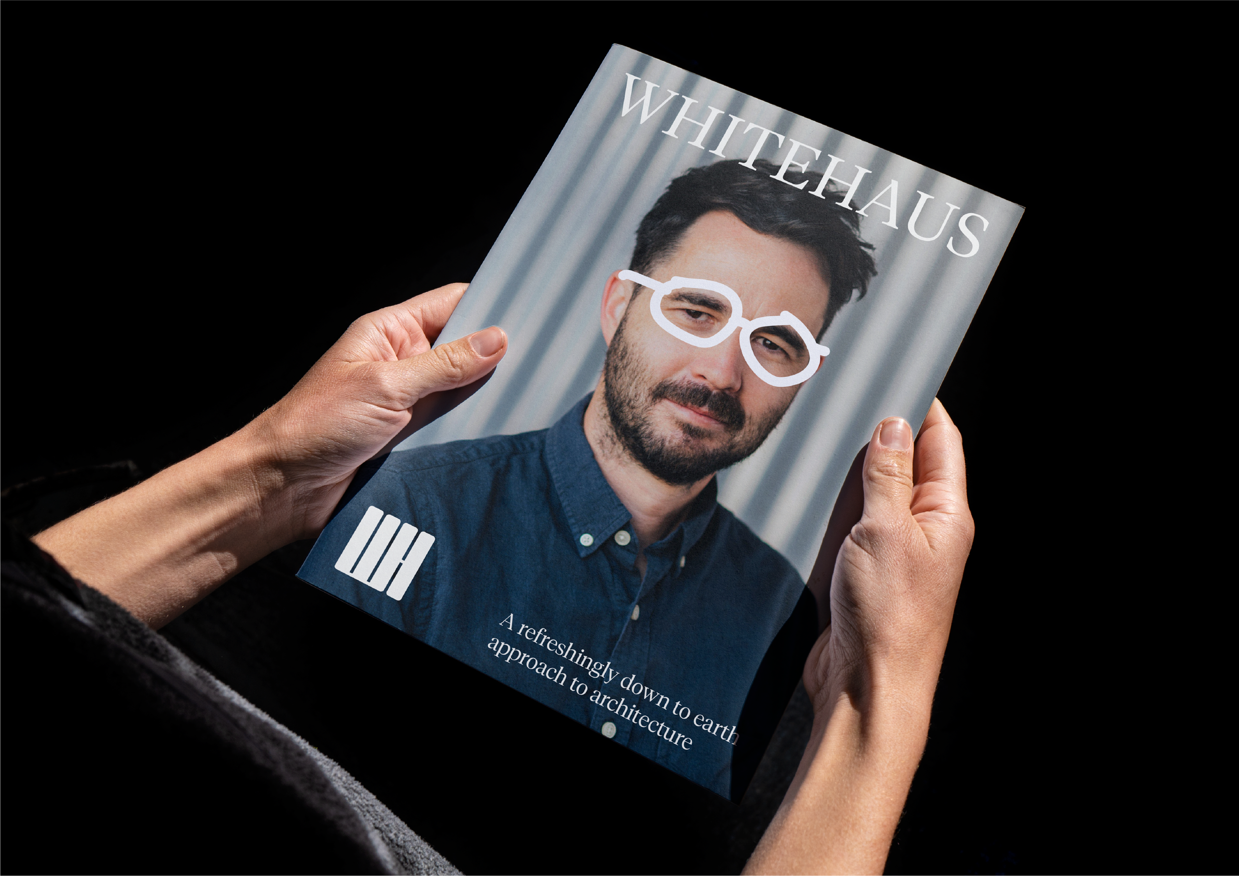
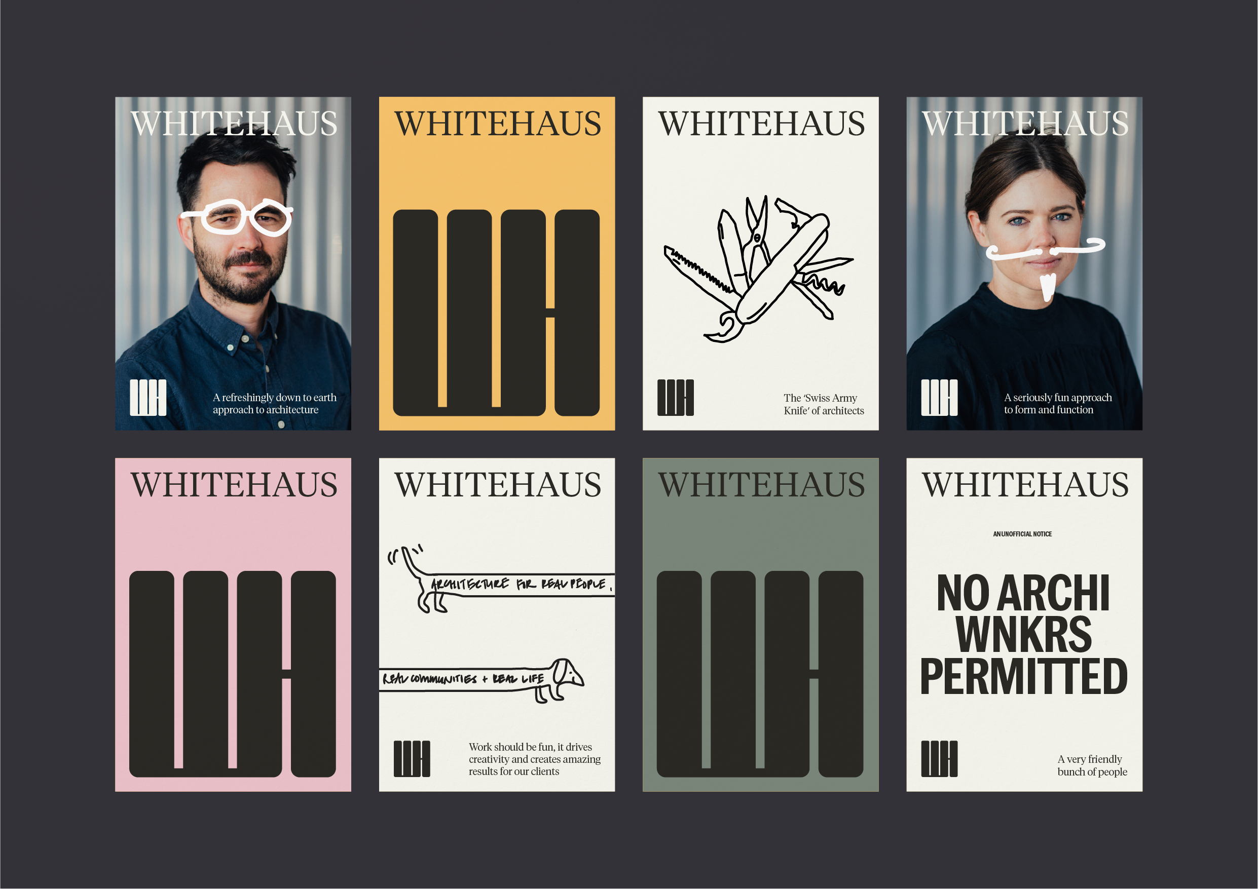
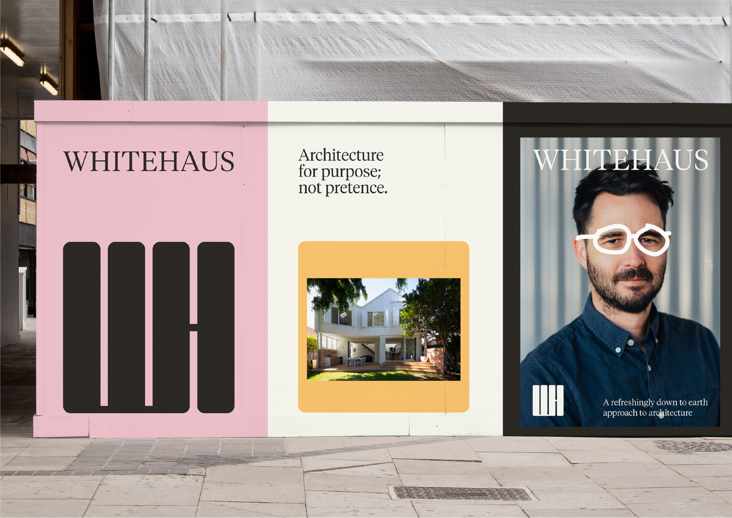
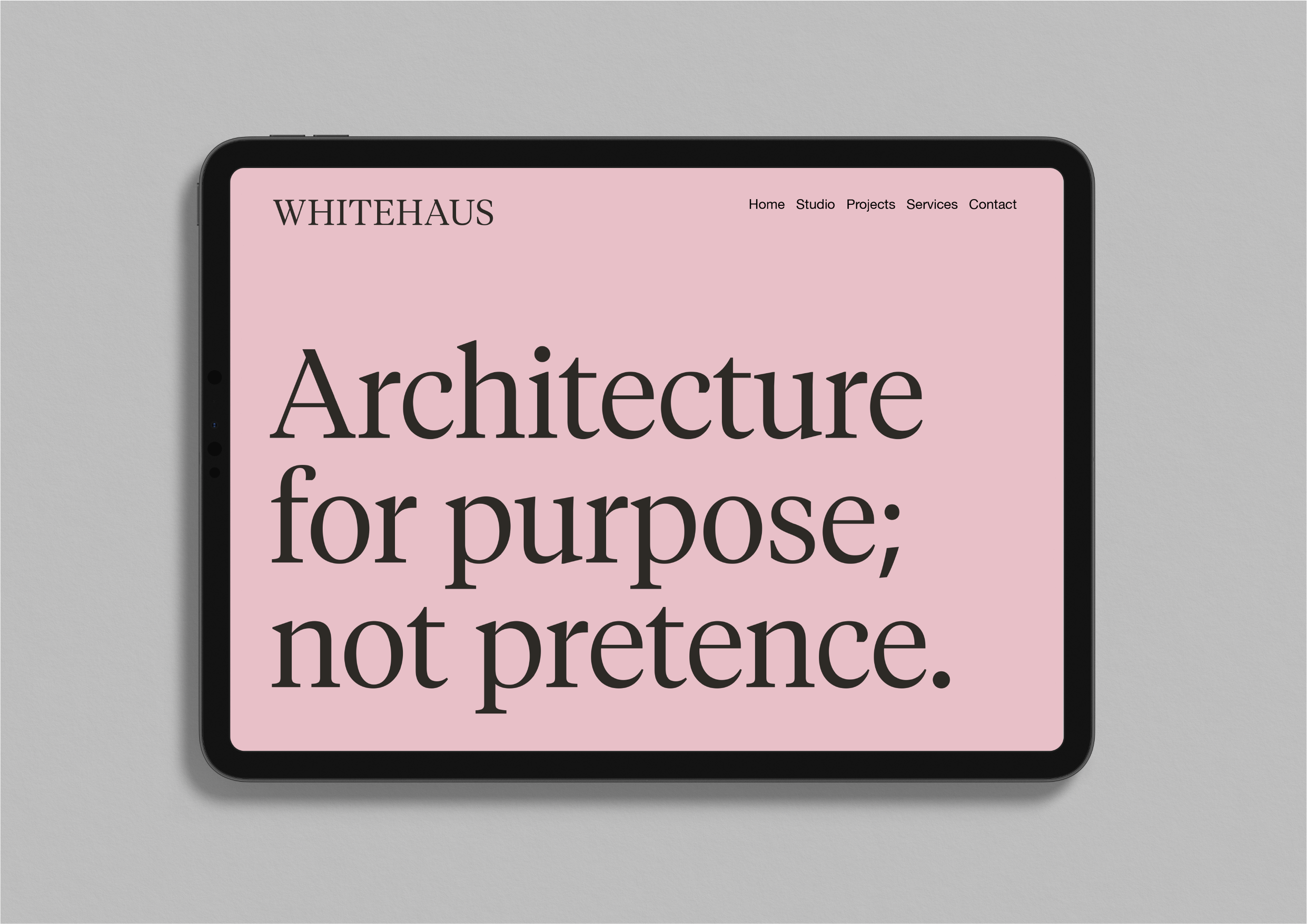
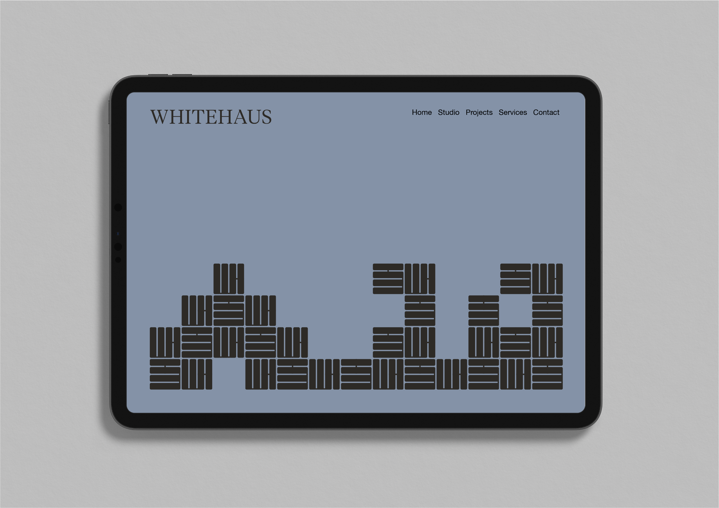
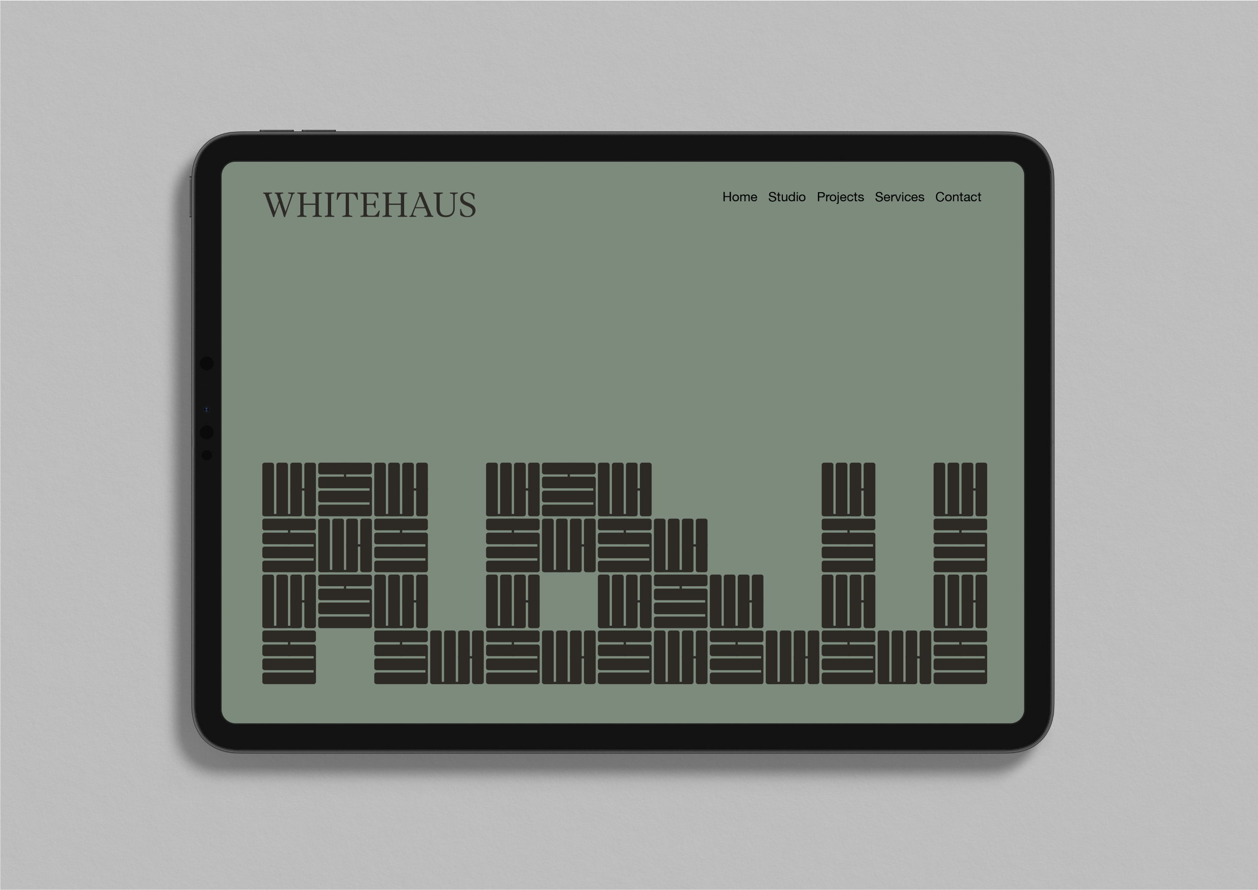
WhiteHaus Architects
– Purpose not pretence
A complete rebrand with applications across the board. The project leans into something more spirited—a relaxed illustrative style that reflects the practice's playful sensibility. We always seek out something distinctive to amplify in each commission. After all, a bit of charm never hurts.

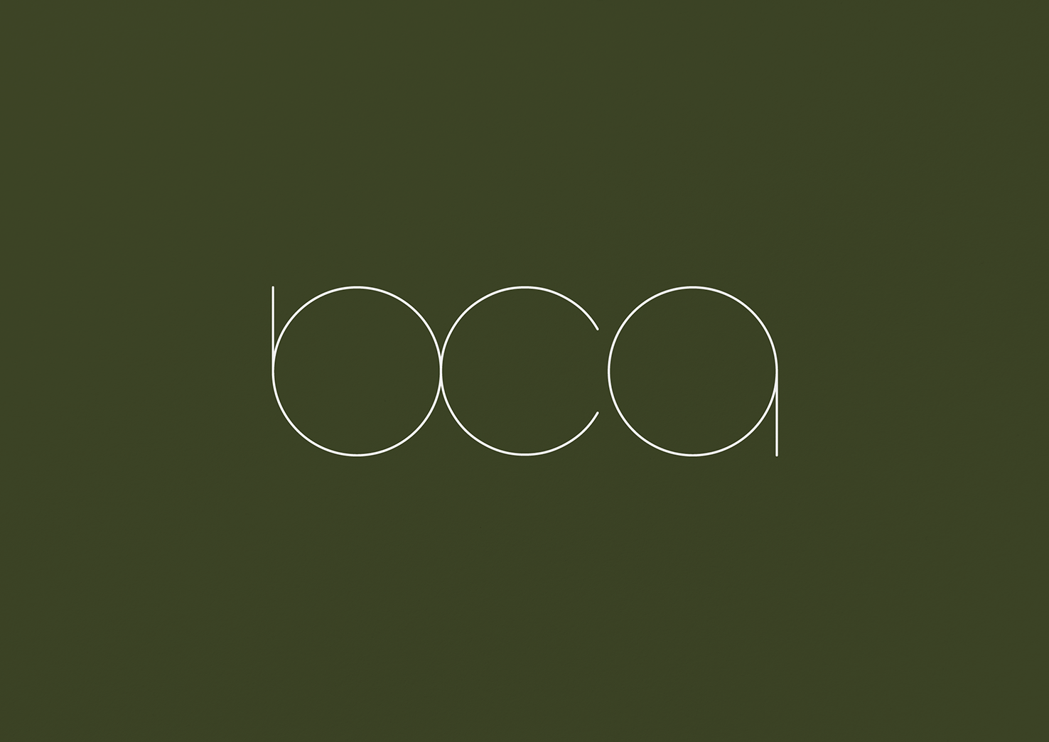
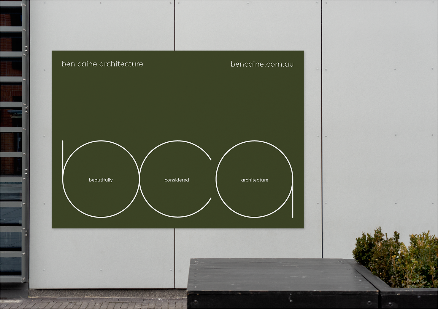
Ben Caine Architects
– Beautifully Considered
Early in the process, we found something that clicked: Beautifully Considered Architecture. The initials—BCA—aligned perfectly with Ben Caine Architects, creating a natural double meaning that felt like it was always meant to be there. It emerged from conversations about what the practice actually does and what Ben Caine really cares about. Beautiful meaning excellence in thinking and execution, not just aesthetics. Considered meaning nothing gets a free pass, everything earns its place. It became the positioning that drives how they talk to clients and the foundation for the entire visual and verbal identity—every design decision and word reflecting the same careful attention and thoughtful craft that defines their work.